
-40%
Responsive design promotes the site.
All elements of web pages open completely, as in the desktop version of the site.
It is convenient to read texts from a mobile device, there is no need to scroll the page in width.
Images are resized to fit the screen.
A single URL with the main site makes SEO easy.
The site style is preserved in the responsive model.
Simple maintenance.
The influx of visitors from mobile devices generates profit growth.
Contact instantly via messenger!
Choose your favorite messenger for Free consultation according to your project.
Make your site mobile friendly!
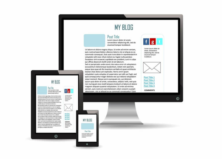
If you look around in public transport or at bus stops, most people spend time in their gadgets surfing the Internet. How will your site open on their devices? If it is not adapted for mobile devices, most likely, those who came from a smartphone will not linger on it: the text is too small with side scrolling, illustrations are not fully displayed, the video freezes. Special layout eliminates such problems.
How it works?
Algorithms transform the content of web pages to fit the screens of gadgets. Elements can be shifted, resized so that their position is convenient for reading. The entire functionality of the platform is preserved, in contrast to the mobile version. It reduces the number of elements for the sake of compactness and increased download speed. The responsive version is fast and complete.
Development of responsive sites: options.
It is possible to work out the entire design or its individual elements:
- When fully zoomed in, blocks are fully compressed, and those that do not scale are stacked one on top of the other.
- Selective scaling changes parts or elements of it.
- When building, blocks are compressed and shifted downward. This option is used most often.
It is time consuming and laborious to create a separate layout for each popular screen size. Therefore, partial or full scaling with offset is used in most cases.
Creating a responsive website design - benefits.
This is a convenience for both the web site administrator and the audience. Responsive layout is beneficial in the following parameters:
- One universal site is cheaper and faster to develop than separate desktop and mobile versions.
- The client will receive full information by going to the site from a mobile. The content of the web pages will be displayed conveniently for viewing.
- A common management system makes it easier to maintain the site. You don't have to promote two platforms separately.
The creation of modern responsive sites is a condition for increasing traffic and promoting to the TOP. The number of mobile users is constantly growing and more and more people are buying from smartphones. A site tailored for small screens is an online sales tool.
Frequently Asked Questions (FAQ)
✔️ Will a step-by-step guide to creating a responsive website help you do it yourself?
It is better not to take risks if there is no knowledge, skills and experience. You can spoil the site.
✔️ How long does it take to create a responsive website?
From several weeks to a couple of months. Depends on the size and type of site. Please contact us and we will tell you the deadline for your project.
✔️ Is creating a responsive website from scratch more expensive than adapting a ready-made website?
Not always. It depends on many factors. Sometimes it is more time consuming to redo and modify than to create it right from scratch right away.
✔️How much does it cost to develop responsive websites?
Prices differ depending on the complexity of the task and the size of the site. Please contact us and we will tell you the cost of working on your project.
✔️ Is creating a responsive website design necessary for any business?
Yes. This is due to the fact that most modern people order services or goods through mobile devices.
✔️ Is it possible to create a responsive website for different devices with different screen resolutions?
Sure. We will make sure that your site supports different resolution settings for mobile phones, tablets and PCs.
✔️ Will creating a responsive website design interfere with the display of ads?
We will select the optimal formats for all advertising materials that are posted on your website. They will freely fit into the screen of any mobile device.