-50%
Responsive website design is essential for 52.2 % users who access the Internet from smartphones and tablets.
Let's make the site display correctly on the screens of devices of all sizes.
We optimize web pages for the needs of smartphone and tablet users.
We will create an individual mobile design for your business.
We will increase the time users spend on your site.
Let's improve the performance of the web resource.
We will save you money by creating one responsive website instead of mobile and desktop versions.
We will reduce the financial and time costs for website promotion.
Contact instantly via messenger!
Choose your favorite messenger for Free consultation according to your project.
Responsive website design development.

Don't let your 48 % visitors leave sites that are not adapted for smartphones and tablets!
If the content of web pages on mobile devices does not open completely, individual elements disappear, images are loaded distorted, which users do not like. We can make the responsive design of your site convenient for those who visit it from devices of any format.
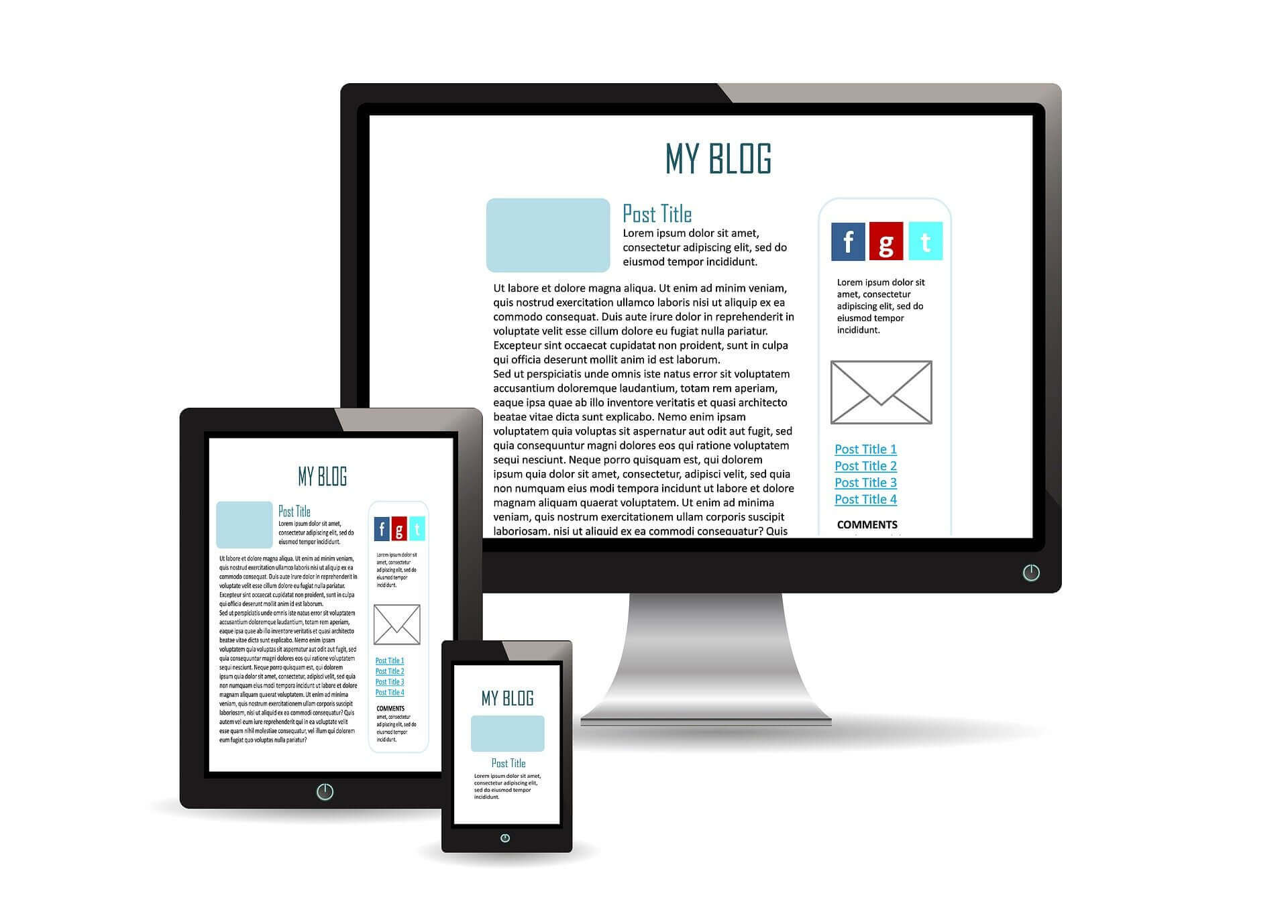
How does responsive design work?
The display of web pages adjusts based on the width of the screen in pixels. It is filled so that the text is easy to read, the images are fully visible, and the navigation is simple. At the same time, visitors will be able to use all the functionality of the web resource.
We make responsive design so that:
- the site has a single URL and HTML code;
- the same content for all types of devices;
- flexible images and layout;
- navigation elements are easy to use;
- video content is displayed correctly on all kinds of devices.
Why else are we doing responsive website design?

Such development is beneficial to the owner of the web resource and useful to users. She gives:
- Flexibility of the interface. All elements are smoothly rendered, content moves freely around the screen depending on its size, keeping its original style.
- User friendliness. He does not have to look for the scrollbar on the blocks or flip the device to view the entire content.
- Saving money and time. If you create separate desktop and mobile versions of the site, and then separately engage in their seo-promotion, this is an extra expense of budget and time.
- Improving the ranking of the site in Google. One of the criteria by which a search engine promotes sites in organic search results is the adaptability of their design.
It is convenient for users of both stationary and mobile devices to interact with your site if its content is displayed in accordance with the screen sizes. It's easy for visitors to find the information they want, browse content, and check out. This is driving mobile sales growth.
Frequently Asked Questions (FAQ)

✔️ Responsive design layout yourself - is it possible?
This is possible if you master the work with HTML, CSS, c website builders and other software. It takes time, skill and experience. It is better to entrust such a difficult job to professionals.
✔️ How to make responsive website design cheaper?
Discuss with the professionals whom you will order the development of what needs to be done for the adaptability of your site.
✔️ Is it possible to do without responsive design layout?
By 2021, the share of mobile sales in all online commerce will grow to 72.9%.
✔️ How much does it cost to develop a responsive design?
It depends on the type of layout, the amount of content, the urgency of the order, and other factors. For details on a specific project, please contact the manager
✔️ Why is responsive website design so important?
A responsive website has a fluid and flexible layout that adjusts to fit the screen size. The importance of responsive web design is that it offers an optimized browsing experience.
✔️ What is the name of the process of creating a responsive design?
A designer's sequence of actions is called the design process, possibly using design techniques. The design process can be short (quick sketch) or lengthy and complex, requiring significant research, negotiation, reflection, modeling, interactive revision and redesign.
✔️ What is responsive feed design?
With responsive design, designers and developers have complete control over what content is displayed and when. Think of it as serving completely different websites depending on what device the user is on. This means that all content, functionality and layout can be customized and optimized for that particular device.
✔️ I am a beginner entrepreneur, what are the benefits of developing a responsive website design?
First, the correct display of your resource on all devices. Secondly, the site will be focused directly on the needs of your customers. Thirdly, this way you will significantly expand the possibilities of your business.
✔️ Why is responsive design so widely used by web designers?
Basically, responsive design is a way to put a website together so that it automatically scales content and elements to fit the size of the screen it is being viewed on. This prevents images from being larger than the width of the screen and saves mobile visitors from having to do extra work to read the content.
✔️ I want to make a responsive design, what is the best CSS unit of measure to use?
Rem is an absolute unit of measurement relative to the root element of the HTML document. Usually used for font sizes. It is a scalable unit in which the browser displays values in pixels. We recommend for your responsiveness. The default font size of the root element is 16 pixels.