Search
Close this search box.
Search
Close this search box.

How does tracking user behavior on your site increase conversions?

How tracking user behavior on your website increases conversions

Imagine that you are running a regular store. From the comfort of your counter, you can see and fix any issues shoppers have as they move through the store. If they find it uncomfortable to navigate the aisles, you can make changes to the design. When they walk up to the counter, you can strike up a conversation and find out who they are and what they are looking for.

On the website e-commerce doesn't work like that. You are tracking total conversions, but you cannot constantly monitor each of the users site. You cannot see people wandering through the pages of your site. You cannot informally discuss their impressions during checkout. Your access to users is limited. It can be difficult to understand their behavior and what they want.

This is where UBA User Behavior Analytics comes in. It provides a window into a user experience that you would not otherwise get.

What is user behavior?

User behavior includes all the actions that visitors take on a website: where and what they click on, how they scroll down the page, where they stumble and leave the page.

Tracking user behavior gives you insight into how people interact with your site and what obstacles or clues they face as your customers.

What is UBA User Behavior Analytics?

It is a method of collecting, combining and analyzing quantitative and qualitative user data. It shows how customers interact with a product or website and why.

UBA is sometimes confused with UEBA - User and Entity Behavior Analytics. It focuses more on cybersecurity and data protection than conversion optimization. Behavioral analytics is also sometimes confused with validation, which is more about predicting user behavior than improving user experience.

When you want an answer to business questions such as "Why are people visiting my site?" or "Why are they leaving?" traditional analytics alone can tell you that there is quantitative activity, but cannot give you any "why." That's where User Behavior Analytics comes in, with tools to help you get a complete picture of user behavior:

  • Session records Is a visualization of real user interaction taking place on your website. For example, clicks, touches and scrolling. You can check them out to see how people actually work with different pages during their purchase journey.
click session records
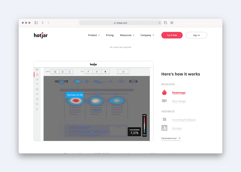
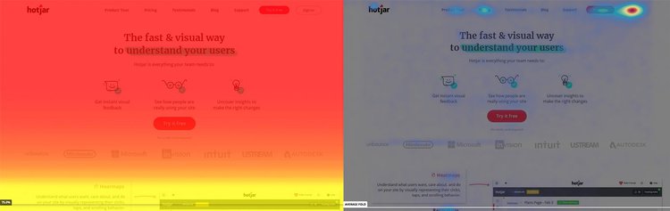
  • Heatmaps Shows where on the page customers spend the most time and where they click. You can see which buttons, CTAs, videos, or other interactive resources are getting the most and least interactions.

Two types of heatmap: left scrolling, right click:

heat map
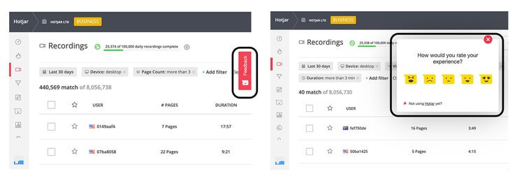
  • Onsite surveys can target specific pages and help collect personal responses from users about what works and what doesn't.
example of a question to the user
  • Feedback widgets allow you to receive hyper-focused visual feedback on specific pages of your website.
feedback widget

4 benefits of tracking and analyzing user behavior on your website.

By investing the time and effort in analyzing user behavior, you can do for your website what a regular store owner can do in his store every day:

  1. Get a real first-hand view of what people are interested in, what they strive for, or what they ignore.
  2. Identify points along the customer journey, where they get stuck, fight, get confused and go away.
  3. Learn how specific pages and sections work.
  4. Understand what your customers want and care about.

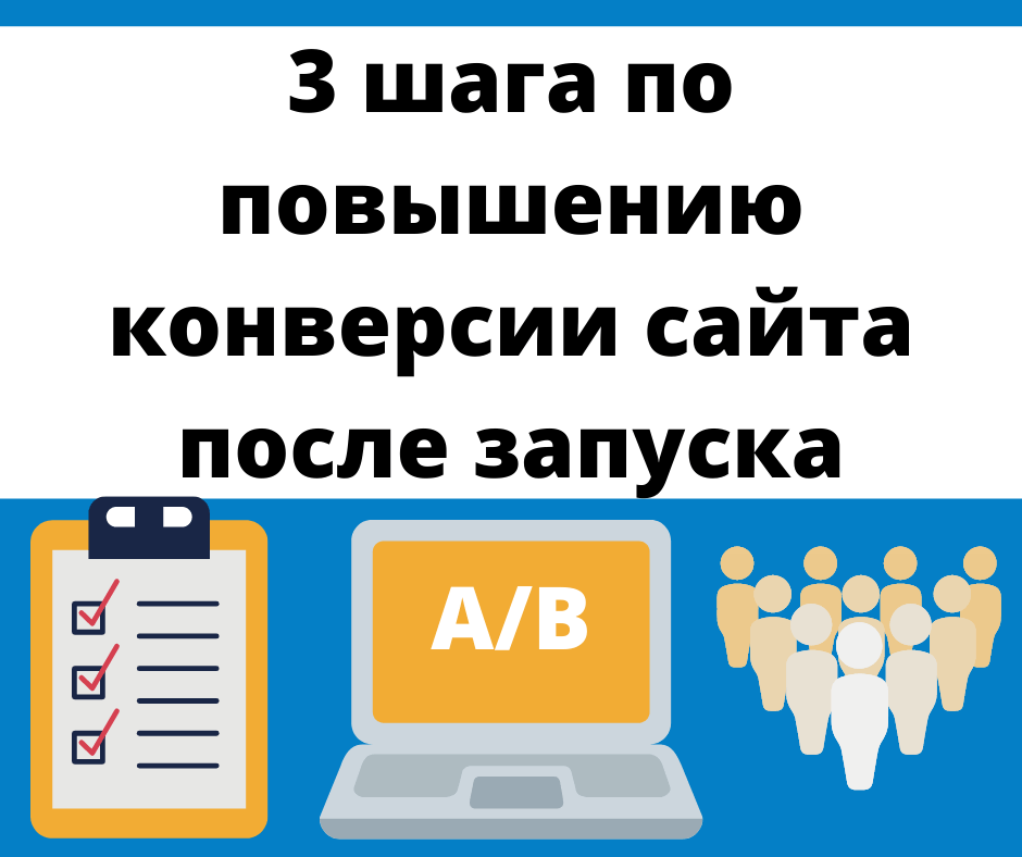
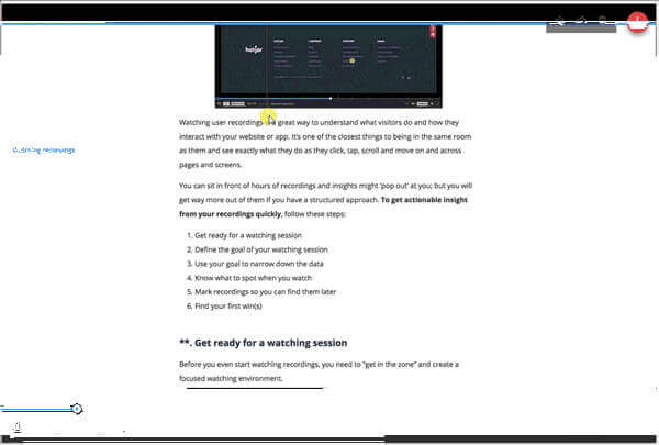
How to analyze user behavior in a simple three-step framework.

To gain a complete understanding of user behavior, you need to strategize the data you collect about user behavior and use it to understand three key things about your users:

  • DRIVERS that bring them to your site.
  • BARRIERS that can stop them or make them leave.
  • HOOKS that convince them to take targeted actions.

Step 1: find out why people are clicking on your site.

To find out WHY users come to your site in the first place, you need to identify the drivers or triggers that motivate them to visit your site.

Hotjar CEO and co-founder David Darmanin believes there are three types of website users:

  • Just browsing wanderers: people who just came in to look and are not going to buy your product.
  • Decisive heroes: people who have come with the sole purpose of buying your product and will make it through to the end, no matter what obstacles they face.
  • Undecided Researchers: people who don't know whether to buy from you or not.

You are unlikely to be able to defeat simply viewing wanderers, you want to immediately get decisive heroes. So it's worth focusing on understanding and serving indecisive researchers. And for that you need to really get into their heads.

So how do you know what they are thinking? Ask them.

Use analytics + onsite surveys to find out user motivation.

First, use Google Analytics to find out which channels are attracting the most users. Log in and go to Acquisition> All Traffic> Source Medium.

traffic analytics

You will see a list of your most useful sources. Let's say, for example, you find that organic search has a higher conversion rate than social media. From here, you can conclude about motivation: people who come through search are more motivated to buy than those who come from social networks. As such, you may want to expand your SEO efforts - search engine optimization rather than Facebook campaigns.

traffic analytics landing page

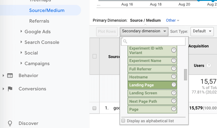
You can narrow your search even further to see which landing pages organic search users frequently land on by clicking on google / organic and selecting Landing Page as an additional report parameter. It will also help you gauge user motivation to search, but it will also help you figure out which pages to post your polls on.

Once you have a list of the most popular landing pages, post a survey on them. Customize a question to find out who your users are and why they visit your site, and collect psychographic data about their views, values, and desires.

Relevant questions:

  • What is the main reason for your visit today?
  • How did you hear about us?
  • How would you describe yourself in one sentence?
sample survey

After collecting a significant amount of information, you can use this data to create custom images that reflect your customers. We need answers to the following questions:

  • Who are you?
  • What's your main goal?
  • What is your main barrier to achieving this goal?

Use the answers to the questions you asked to draw conclusions and create short profiles of your ideal clients. You can use them to inform and improve your marketing and design efforts.

Step 2: find out what drives users to leave your site.

In our DRIVERS / BARRIERS / HOOKS model, barriers are pain points that prevent website visitors from becoming customers. This can be anything from the way prices are displayed to the wording on the product page to a broken form at checkout. Analyzing user behavior can help you understand why people are dropping out of the funnel so you can eliminate these leaks and increase conversions.

Identify problem areas, then use recordings and heatmaps to explore.

Instead of analyzing user behavior on every page of your site, focus on the problem pages first. You can identify them with Google Analytics by looking for the pages with the highest exit rates. Go to Behavior> Site Content> Exit Pages.

Once you have identified the pages you want to explore, use the session records, to see what users were doing before they left. Filter entries by exit URL to see only those users who have abandoned the specified page.

In addition to session recordings, set up heatmaps to see user activity. For example, where users navigate, click and leave on each page. Look for evidence that people aren't engaging with important links, buttons, or CTAs.

With enough information, you can see exactly what users were doing, reading, or watching before they decided to leave the page. From here you can draw conclusions about the reason. Maybe your CTA is missing, your link isn't working, or your page isn't rendering correctly.

heatmap search for site problems

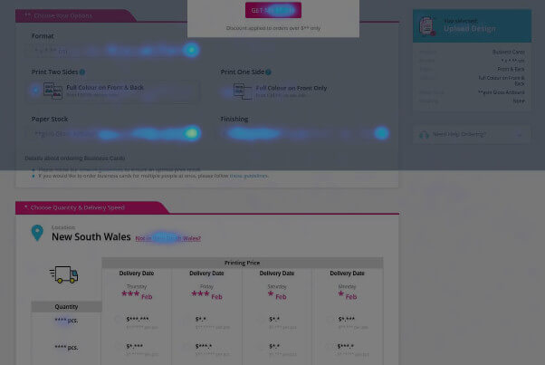
For example, Zenprint, an online printing service provider, used notes and heatmaps to find specific issues that were causing visitors to leave their product page. After finding a design problem in their pricing table, they tested other projects, found and implemented one that was more sales-boosting, and removed that initial barrier.

Step 3: find out what convinces users to convert.

A powerful way to increase conversions is to study what happens when people convert. This is one of the most overlooked factors in user behavior.

When things are going well, we tend to celebrate instead of learning from it and applying the findings elsewhere.

Knowing why people are converting will help you:

  1. Identify your product's greatest strengths that you can further enhance.
  2. Choose the most compelling parts of your website to build a stronger sales funnel.
  3. Analyze your users, helping to create a clearer picture of your ideal customer

To understand the hooks that convince certain users to complete the checkout process, you need to find out what the users themselves have in common. What brings them to your site? What made them overcome the above “barriers”?

Find out what motivated visitors to become customers by collecting user reviews.

In this case, the most effective way to find out about your customers is to ask them. You can do this in several ways:

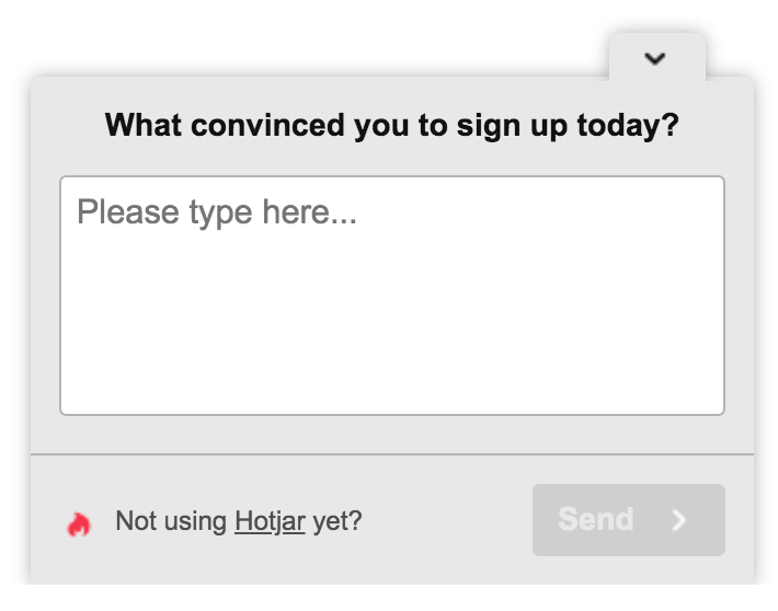
  • Set up a post-purchase survey on the thank you page. Ask customers, "What convinced you to subscribe / convert today?"
  • Send customer surveys by email and ask them questions about yourself and the decision-making process, including:
    • What was the obstacle that would have prevented you from using or buying the product?
    • How would you rate your overall shopping experience?
    • What almost stopped you from making a purchase?
  • Interview people. Ask loyal customers if you can call them. Ask them to talk to you about their shopping milestones. While you may not be able to speak to a statistically significant number of people, you will be able to spot similarities in just a few interviews.

Then analyze the responses to figure out what went right and how you can maximize that on your site.

Start tracking user behavior now!

Are you anxious to test your users? Get started now, apply these tips consistently, and share the results in the comments, please. Successful analysis, beneficial changes and conversion growth!

Based on materials from the site: www.hotjar.com.

❺ How do heatmaps work?

Data is collected from a web page. The program uses a dark to light color scale to show which content on a web page is being clicked more or which area is attracting the most attention.

❺ How to read a heatmap?

In two ways: by looking at the visualization and by viewing the raw data. You can instantly spot trends and click issues with color-coded heatmaps. Red means most interaction, blue means least.

❺ What else to ask in the survey?

THAT you need to know about user behavior: why did they visit your site, what they liked, what they didn’t like, etc.

❺ Why is user behavior similar?

Identical tasks or on the site all of the elements are inconvenient.

💵 How often should the user behavior check be done?

When the site is recently launched, traffic drops, traffic increases, there are complaints, etc.

💵 How much analysis of user behavior should be done?

It depends on the task: sometimes a day is enough, sometimes it will take 2 weeks or more.

💵 Where can I get a heat map?

There are services and tools in Google Analytics.

3 steps to increase website conversion after launch.

3 steps to increase website conversion after launch

Once launched, an online project will never be fully effective without additional outside effort. Only through further optimization site he will reach his full potential. It will give growth conversions.

There are two characteristics of the Internet that make it a unique and exciting design medium. It's its ability to collect unprecedented amounts of data about how users interact with it, and the ease with which something can be changed.

Yet despite the enormous potential of digital technology, many companies ignore it completely. They are launching a website and apart from a few text changes and updates, they are not working on it until the next redesign in a few years.

The top companies on the Internet are constantly optimizing their sites after launch. This is how they unleash their full potential.

Amazon avoids redesigning its website, instead evolving it over time with a rigorous testing program:

Amazon is gradually developing the site design

The importance of this ongoing optimization cannot be overstated.

Why is post-launch optimization critical?

In truth, you can do whatever pre-testing you want. However, you do not know how users will react to the website prior to launching it. Checking before you start will certainly avoid costly mistakes. However, it cannot provide a completely realistic picture of real-life experience.

However, users interact with the current site on a daily basis. Problems become apparent, how they arise, and how to fix them.

Improvement of critical indicators.

If you have the time and resources to optimize after launch, you can dramatically improve engagement and conversions.

Small changes after launch can make a huge difference to a website's performance. For example, Jared Spool saved users from having to sign up for an e-commerce site to complete a purchase. This generated 45% sales growth, which equated to $ 300 million in revenue growth in the first year alone!

Post-launch testing can also provide significant cost savings as it avoids periodic rework.

Avoid costly changes to the look and feel of web pages. Website redesigns are extremely wasteful for two reasons:

  1. When upgrading, a web resource, as a rule, discards the good that is in it. It is being built, one might say, from scratch. This is a crude technique that ignores how certain elements of your existing site will work.
  2. Because redesign is expensive, it only happens once every few years. For most of their life, web pages don't perform at their best.

Instead, we must evolve our sites over time through rigorous post-launch testing. But what exactly does it look like?

Optimization process after launch.

When a site is launched and users have time to adjust to it, a cyclical optimization process is usually applied. It consists of three steps, which are repeated almost constantly:

  1. Find a problem area to solve.
  2. Determine the exact problem.
  3. Check out possible solutions.

Consider implementing a cyclical optimization process that optimizes your website over time:

cycle search for problems optimization

Let's take a closer look at them.

1. Find the problem area.

Website optimization starts by identifying areas of the site that are not performing at their best. To do this, you need to be clear about exactly what the problem is.

What are the problems to look for?

Disadvantages are usually found in three key areas:

  • Involvement... Are users not interacting with the content or are they leaving the website prematurely?
  • The convenience of use... Are users struggling to find the content they want or complete important tasks on the website?
  • Conversion. Do users leave the site before completing the call to action? Those who have acted will not return to the site later?

Looking at such metrics, you will realize that there is room for improvement. Then you need to determine where something is going wrong on the site. As a rule, an analyst can help with this.

Using analytics to find problems.

Finding trouble spots is not an exact science and requires some intuition. However, this is a good starting point for identifying common areas where problems may arise.

Even with limited knowledge of analytics, it is relatively easy to find potential problems on a site.

Analytics is a powerful tool for identifying potential problems on web pages:

example of site analytics

It is important to pay attention to:

  • Bounce pages... These are pages that users go to and then immediately leave without viewing any other content. Pages that don't take the user deeper into the site and don't trigger a call to action are usually an area for improvement.
  • Site routes... What path do users take through the site? Are they taking the most direct route to the call to action or are they distracted? Are there some paths through the site that perform worse than others? If people follow a specific route, is it likely that they will quickly leave the site?
  • Pick-up points... What pages make people leave the site?
  • High latency pages... Which pages are slowing down the user's journey? What pages do people usually get stuck on?

We are interested in analytics of specific pages. In other words, knowing the overall latency or bounce rate of a site won't help narrow things down. 

You need to know which pages have a high bounce rate or latency.

As a result, you should get a list of potential pages that may have problems. Of course, just because a page has a long wait time or a lot of people leave the site doesn't necessarily mean it is crashing. Knowing which pages the problem might be on also prevents us from accurately diagnosing the problem.

To understand exactly what is going on, we need to take a closer look at each problem page. Unsurprisingly, I start by focusing on the most underperforming page based on the above criteria.

2. Diagnosis of the problem.

To find out the cause of the problem, you can start with an application such as Fullstory or Hotjar. They provide two useful tools for diagnosing problems - heatmaps and session recorders. These tests provide insight into the cause of the problem.

Hotjar has a heatmap and session logger:

heatmaps Hotjar example

Using heat maps.

Heatmaps are a great starting point to narrow down potential issues on a page. We use scroll maps and heat maps.

Scroll map gives a clear idea of where people's attention is focused on the page. If people are viewing an important piece of content or a call to action, you may have found your problem.

Cards  clicks are also useful because they help you understand if users understand the page. Are they trying to click on objects that cannot be clicked on? Are they clicking on secondary content that takes them away from your call to action? Or worse, do they angrily click randomly out of frustration !?

Heatmaps provide a useful overview of the behavior of site visitors. And viewing some of the user sessions will provide more specific information.

View session records.

Once you see potential problems, it is worth reviewing the user session records to see if the users are actually behaving as expected.

For example, imagine that users seem to be clicking on an inactive page element. Using a tool like Fullstory, you can filter all recorded sessions and view only those sessions in which users tried to click the item. Now you can see what they did next, or even in some cases, what caused them to click the item in the first place.

After clicking, did they leave the site or did they adapt and continue working without problems? If they have given up on their task, then there is clearly something that needs to be fixed.

Of course, session recordings have their limits. Sometimes you observe the behavior of users and do not understand why they did this. In cases where you get confused, it's time to turn to usability testing.

Usability testing launch.

If time permits, after identifying a specific issue on a specific page, it is worth doing a quick usability test. I set up a simple test that will require the user to find the problem area that I have identified and see what happens. I observe their behavior and ask them to explain what they did and why.

This test is usually done in magnification and only takes a few minutes. You can often rely on friends and family for this testing if the website is not highly specialized.

At this point, there will be a pretty clear idea of the problem with this page on the website and a few ideas on how to fix it. But how do I know which approach is better and make sure I don't make anything worse?

This brings us to our final step - testing our potential solutions.

3. Checking possible solutions.

There are two main approaches - quantitative and qualitative. With that in mind, let's look at these two options and when we should use each.

Using quantitative A / B testing.

One of the most popular post-launch site optimization options is A / B testing. This quantitative approach to testing is effective because it works with real users who interact naturally on your real website. If your solution performs well in A / B testing, you can be confident that it will work when deployed across a site to all audiences.

If you don't know, at the most basic level, A / B testing involves displaying the percentage of site visitors with different versions of a page. This allows you to try one or more potential solutions on a live site to see if any of them work better than the current version.

A / B testing shows different users different versions of a page:

A / B testing an example of showing several versions of a page

By showing options to only a small percentage of users, you avoid deploying a solution that could actually make things worse.

To be sure that the solution will perform better, you need to collect enough data to be statistically accurate. This perceived need for a large number of results can discourage people from using A / B testing, thinking it is a tool for high traffic sites like Amazon.

Option for low traffic sites:  wait until there are enough results... Yes, this takes some patience, but it will yield statistically significant results.

Another approach is evaluate the effectiveness of the solution without waiting for a statistically significant data set... Just because an A / B testing tool says you don't have enough results doesn't mean you should listen to it!

The last option is adapt the test to increase the number of results you get... This can be done by closing the gap between the test object and the transformation point.

For example, changing the text in a subscription form to a communication site is closely related to the success criterion for clicking a subscription button. However, testing the impact of blog post title on subscription is not as tightly coupled, so conversion rates will be relatively lower. This means that you will have to wait longer for statistically significant results.

The more steps you take from the testing point to the conversion point, the more users will drop out and the longer it will take to get results.

For something that happens infrequently, such as subscribing to a newsletter, you may want to consider a smaller, more common action. If you want to test the titles of these blog posts, you might be better off checking how many users are clicking to view the post, rather than whether they're going to subscribe.

Without a doubt, A / B testing is a powerful and great way to optimize your website. This is especially true when it comes to testing different combinations of text and images.

In fact, there are many tools out there that allow you to create variations of content on your site without any coding skills. Google even offers a free tool called Optimize, which requires no configuration if you already have Analytics installed.

Creating basic variations in Google Optimize is incredibly easy!

However, things get much more complicated if the changes in your variations are more significant. In such cases, quality testing may be more appropriate.

Conduct quality testing.

Quality testing mainly revolves around prototype testing with a small number of users. Instead of testing solutions on a real site, you prototype and test usability.

Quality testing has several advantages over A / B testing. Not least because you don't have to rely on statistically significant results. This means you don't have to wait long to find out which solution works best.

There is another advantage to quality testing. It tells you why a particular option worked better. This is because you can actually ask users what they did and why. While quantitative testing is useful for identifying problems, it doesn't tell you why the problem is occurring. This is where quality testing can help.

However, probably the biggest benefit of quality testing is that you are testing a prototype. You don't need to create a fully working version of your variations, which allows you to test more complex changes with just a design kit or wireframe.

Both approaches have their advantages and disadvantages, so it makes sense to combine them appropriately. Together, they should lead to a solution that should fix whatever problem you identify.

Once you've deployed your solution, you can turn your attention to the next problem.

Constant cycle.

The secret to success in optimizing your site is to make it an ongoing process.

This means that when you fix one problem, you go back to the beginning of our three-step process and start again by identifying the next biggest problem in the experience. By constantly changing your site over time, you will gradually improve its performance and avoid the need for an expensive redesign over the years.

By repeating the cycle: testing - clarifying the problem - fixing - testing - clarifying the problem - fixing, you will gradually improve your site's performance. You will avoid the need for an expensive redesign in a few years.

Of course, the reality is that even if you're looking to optimize your site for the long term, it's not always easy to get stakeholders to agree. We conclude with three tips to ensure post-launch optimization.

Providing post-launch optimization.

First tip: make sure you build post site optimization into your initial project plan when redesigning your web pages. Most project plans end on website launch, and this is never a good idea, even if you don't intend to do continuous optimization after launch.

When a website launches, there are inevitably errors to fix and content to tweak. This is why it is worth launching a site for about two-thirds of the total project time. This gives you enough time to troubleshoot problems and gives you the opportunity to develop a post-launch optimization habit.

Second, it's important to talk about post-launch functionality from the very beginning of the project. Stakeholders usually have ideas on how the site can be improved. To avoid volume creep, start the second step of your wishlist. This will establish the idea that the website can evolve and change after launch.

Finally, take every opportunity to talk about post-launch during development. Ask questions about how stakeholders are going to use the resources and manage the site after launch.

When it comes to post-launch optimization, something is better than nothing.

Even a few weeks of post-sales optimization will help than no optimization. Stakeholders don't need to continually strive to improve the site. If you can convince partners to optimize for just a short time, they will quickly see the benefits in the long run.

Based on materials from the site: https://boagworld.com.

✔️ How to use Hotjar for heatmaps?

Sign up with Hotjar, add the Hotjar tracking code, a JavaScript snippet, to your website, then go to your Hotjar dashboard. Click Add Heat Map, select the page you want to target, then click Create Heat Map.

✔️ How do I know my Hotjar for analytics is working?

Once you've installed Hotjar correctly, there is a built-in system check. In the Insights panel, click the Tracking button in the upper right corner.

✔️ What other important types of website analytics are there?

It is important to track such indicators:
Interactions for visiting pages / sessions, converting visitors back, cost per visit, costs of attracting leads - cost per conversion, page views, etc.

✔️ How to write usability testing questions?

Questions should be clear, specific, and directly related to your testing objectives. For example: "Can you tell me why you clicked on A instead of B?" These are questions that require a detailed answer to identify the problem on the site. If you need quantitative data, ask closed-ended questions with a yes / no answer.

❤️ Can we automate usability testing?

For usability testing 
random gesture input is required, which only a human can provide. It is difficult to create an automated process for this type of test. The purpose of a usability test is to assess human behavior.

❤️ How long should an A / B test take?

To keep your data accurate, experts recommend running the test for at least one to two weeks. 

❤️ When should you not use an A / B test?

Do not conduct A / B testing when you do not have significant traffic yet, you do not yet have an educated hypothesis, the risk of immediate action is low.

Back call

Write to us