Learn to design websites taking into account continuity and standards... Understand the reasons why they are important to include them in your work. "Continuity and Standards" Derived from the Guidelines Jacob Nielsen and Rolf Molitsch's "Ten User Interfaces" are evident in many widely used products created by some of the most successful companies.
Products like Adobe Photoshop, originally released in the 1990s, and Google Gmail, released in the mid-2000s, are just a few of the widely popular products that demonstrate this important rule of thumb. This article will teach you to recognize usability standards and explains why they are important in user interface design.
Содержание | Быстрая навигация
Two key reasons for consistency and design standards in website design.
When designing a user interface, it is important to keep in mind the interactions that take place between human cognition and the screen you are designing for.
Making it easy for your users means not forcing them to learn new views or toolboxes for each task. Reducing the length of the thinking process by eliminating confusion is also the right choice when it comes to improving the user experience (UX).
1. Reduce training time.
Continuity limits the number of ways in which actions and operations are represented, ensuring that users do not have to learn new views for each task.
In addition, setting design codes such as platform agreements allows users to accomplish new tasks without having to learn a whole new set of tools. This may sound like a simple concept, but there are many examples of inconsistencies in their designs.
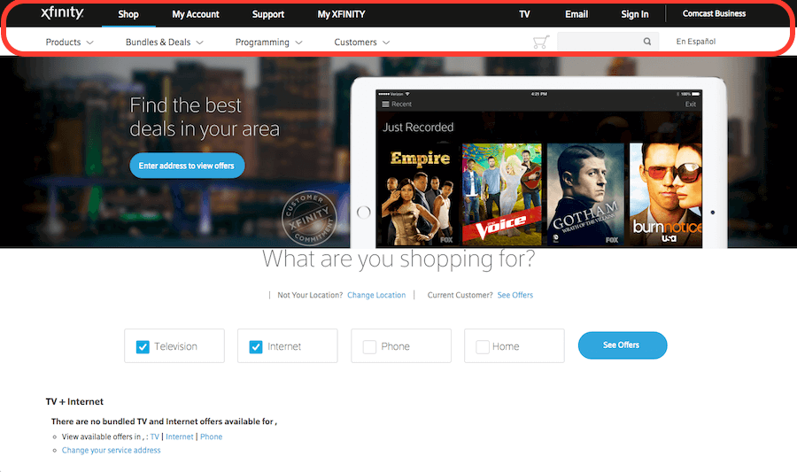
One such example illustrating this problem is the website of the American media company Comcast Corporation for Xfinity.
On their website, not only is the secondary menu inconsistent almost every time the user clicks on another page, but also inconsistent for the main menu. Let's see and compare three different site pages: home page, my Xfinity and TV.
Author / Copyright: Comcast Corporation. Copyright Terms and License: Fair Use.
This is the home page of the Xfinity site. Note how the annotated area highlighting the primary and secondary menu bars will differ as the user navigates to other pages.
Author / Copyright: Comcast Corporation. Copyright Terms and License: Fair Use.
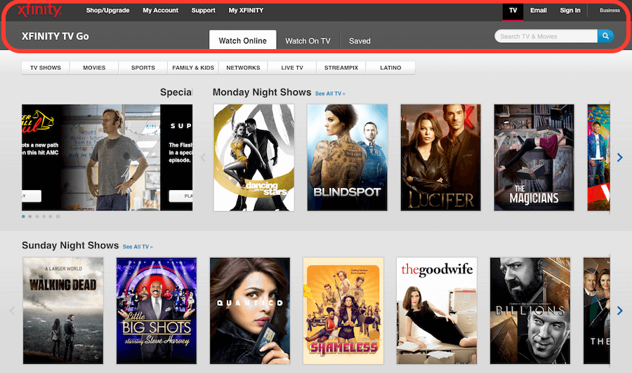
This is the TV page of the Xfinity website. What confuses the user is that the colors, layout and font styles are different from the home page.
Author / Copyright: Comcast Corporation. Copyright Terms and License: Fair Use.
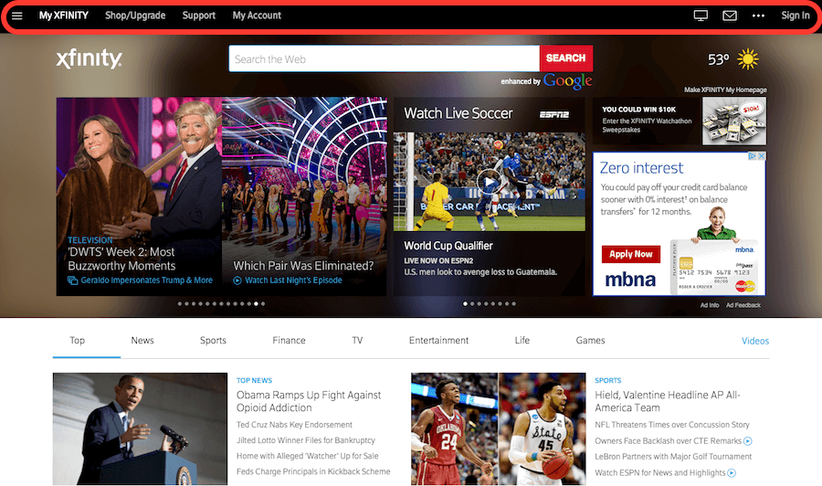
This is the My Xfinity page on the Xfinity website. All three pages discussed above have very different colors, layouts, and font styles in their navigation menus. These differences make it confusing and confusing for the user as it no longer looks like one website as if they were three different companies.
2. Eliminate confusion in website design.
Users tend to apply the rules they encountered outside of your website or product, bringing in their own expectations.
Knowing this, we must be mindful of whether we cause confusion and alienation when we deviate from design standards.
Plus, users don't have to waste time wondering if they mean different words, interactions, or actions in the context of your product.
Confusion occurs when people cannot "piece together" information, and sometimes prevent them from achieving something.
When a user is prevented from reaching their goal, it is understandable that they may feel angry or frustrated. It's no secret that confusion tends to be frustrating and frustration leads to poor user experience.
Five ways to design quality site usability.
There are many aspects to achieving consistency in your user interface. Here are 5 things you can look out for to improve the consistency of your projects:
1. Your choice of language.
The language you use both in your marketing brochure and in the language used in your user flow can not only affect how your product is perceived by your users, but can also lead to confusion when you use different terms to represent the same things. This applies not only to the terms you choose, but also to the tone in which you convey your message.
Scaring your user with a serious and threatening error message when they browse the site will surely kill the good UX of the site, namely the user experience.
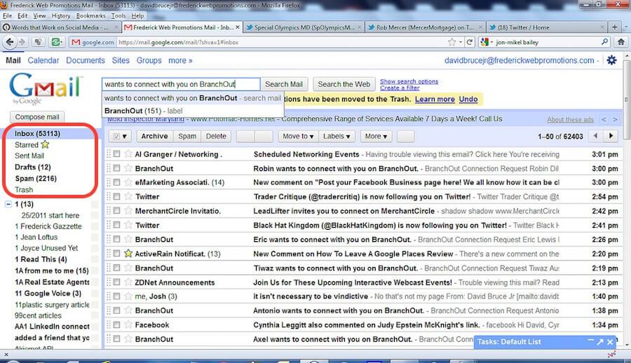
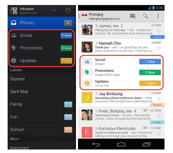
When things mean the same thing or perform the same operation, they should be presented the same, as is the case with Google email, Gmail.
Depending on the organization style of the client email applications, Gmail folders are labeled as Inbox, Drafts, Sent Mail, and so on. The language used for these folders shows familiarity and consistency to anyone who has used email applications in the past. ...
Author / Copyright Owner: David Bruce Jr. 2011. Copyright Terms and License: CC BY 2.0
Folder shortcuts in 2011 Gmail display various familiar options. The language used for these folders demonstrates consistency because it uses Inbox, Drafts, and Spam tags — all familiar to anyone who has used email applications in the past.
2. Apply UI elements wisely.
Commonly used user interface elements such as message boxes, menu bars, icons, scroll bars, and radio buttons are graphical elements that are generally consistent and widely understood by users.
For example, switches are intended to be used when only one option is allowed. Check boxes should only be used when the user is allowed more than one option. In many ways, we can see HTML5 surpass Flash at the end of 2014.
One of the reasons is perhaps the ease of use and ease of use that developers, designers and users can enjoy as a result of the consistency and standards of HTML5.
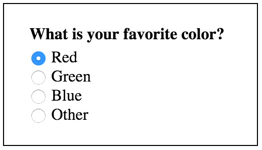
Radio buttons only allow one option. So only makes sense for inline HTML radio buttons.
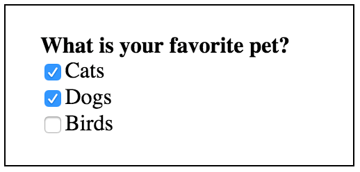
Checkboxes allow more than one option.
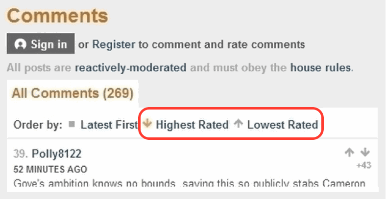
A bad example of consistency in the selection of UI elements appears in the comments section that was previously used on the BBC news site.
Comments from users with the highest rating are indicated by an arrow pointing to the south, however, users must click on the arrow pointing to the north to increase the rating of the comments. Using the arrow on the south side to present the highest-rated comments is also counterintuitive; increasing numbers go up, not down. When users browse the comment section of a webpage, they can simply act according to the arrows without reading the action labels, which can lead to incorrect evaluation and choice.
Failure to use commonly used visual representations will cause the user to deliberately interact with the user interface in an inconvenient way, which reduces the speed at which he could complete desired tasks.
Author / Copyright: BBC. Copyright Terms and License: Fair Use.
The BBC comments section displays a down arrow for "Highest rated" and an up arrow for "Lowest rated". This view is inconsistent and confusing for your users, as “above” is usually synonymous with an up arrow and “below” is synonymous with a down arrow.
3. Consider various well-established usability standards when deciding on your layout.
When you're designing with the user's perspective and knowledge in mind, it's important to understand that people have a strong memory of where things are visually positioned on the screen. You should use this characteristic by reserving frequently used locations for various graphic elements, such as having a logo in the upper left corner, a search box in the upper right corner, an exit icon in the upper right corner, etc.
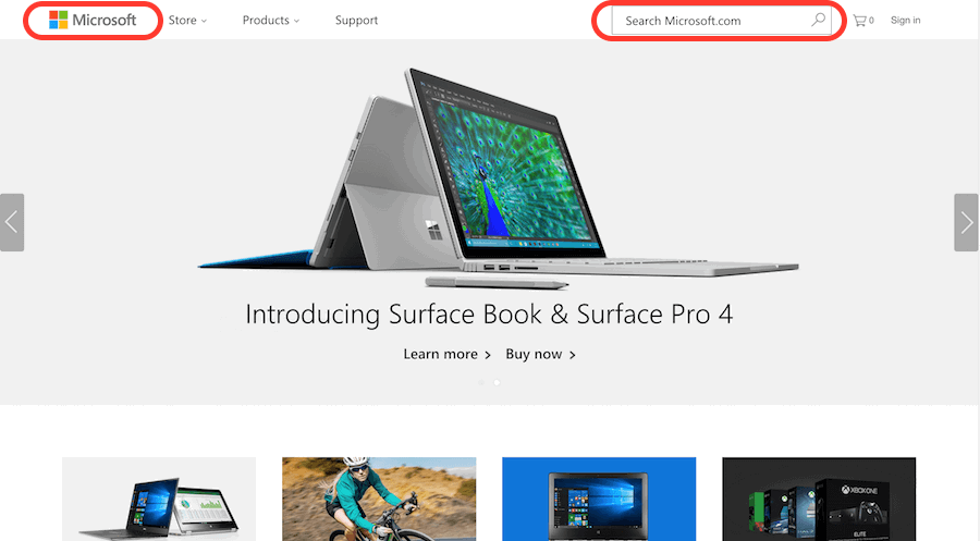
Author / copyright holder: Microsoft Corporation. Copyright Terms and License: Fair Use.
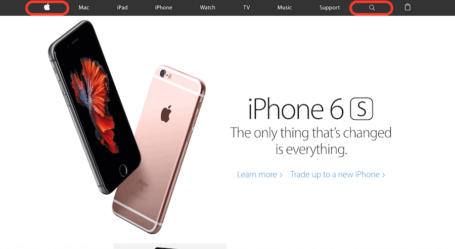
Author / Copyright Owner: Apple Inc. Copyright Terms and License: Fair Use.
Both Microsoft and Apple display their logo in the upper left corner and the search box in the upper right corner of their websites. This form of consistency in layout helps users feel guided when browsing a new and unfamiliar site.
4. Usability is the design of your user's expectations.
Make sure you have the features and functionality that users expect to see on your site. For example, an airline website must have a ticket booking system, and a music exchange site must have a media player.

Author / copyright holder: Youtube. Copyright Terms and License: Fair Use.
Obviously a video player will be installed on a video sharing website like YouTube. This is a great example of continuity in that the site's features and capabilities support what the user expects.
5. Create standardized visual design elements for your website.
Make sure that when you design your site, the visuals are consistent throughout the site.
Content, user interface elements, fonts, backgrounds and colors must be harmonious and consistent at every point of contact. As mentioned above, following the technical conventions that exist in HTML5 and CSS3 form is one way to maintain consistency.
Meanwhile, having a branding and style guide to follow helps with design decisions like colors and fonts.

Author / copyright holder: Jan-Alfred Barclay. Behance. Copyright terms and license: CC BY-NC 4.0
An example of a style guide and branding guide developed for Goodnyt. Having a style and branding guide will help you make sure your visuals are consistent across your site.
A bad example of consistency in color and font choices can be seen in the 2013 version of Google's Gmail mobile user interface. While it can be argued that "meaning" is not affected in this case, it cannot be denied that the user experience is almost always degraded as a result of any strange visual differences between screens.
Author / Copyright Owner: Google Inc. Copyright Terms and License: Fair Use.
A screenshot of the mobile user interface of the Gmail app when it was first released in 2013 shows a mismatch in the choice of color frames and font styles.
Conclusion. How to design a website?
Consistency and standards are recognized as a basic design principle and should apply to all content and interactions within your product.
There are several aspects of consistency that we can look out for when improving our designs, including the language we use, the user interface elements we choose, how our site is hosted, the features and capabilities we include, and the visual components. we choose as Colour and font.
While consistency helps improve the user experience by eliminating unnecessary training and user confusion, it's important to remember that you should use it when needed, but not let it limit design innovation where it makes sense.
You can use to your advantage by following standards and conventions and being consistent. This will free you from relatively trivial design decisions. It will save you time and free your mind so you can still to improve your design and usability for your users.
Source: https://www.interaction-design.org/literature/article/principle-of-consistency-and-standards-in-user-interface-design
✓ What are the design standards in 2020?
Minimalistic design. Video content. Large font. White background sites.
✓ What are the design rules in 2020?
A white background is required. No more than two colors per page. Bulleted lists and large headings.
✓ How to correctly match the colors in the design?
There is no single rule for this, but there is a standard. No more than two colors per design.
✓ What is better than radio buttons or checkboxes?
The radio buttons only include one option. Checkboxes allow multiple choices.
✓ What are usability standards?
Usability standards.
Promote a consistent user experience by providing common reference for all development teams or on time.
Provide comprehensive, authoritative, broadly agreed statements of best practice.
Put user experience issues right into your business agenda.
✓ How many hours does it take to build a website?
It will take 40-100 hours to create a website with a 6-8 page template.
✓ What is usability satisfaction?
User satisfaction is just one important aspect of usability.


1 thought on “Проектирование сайтов по стандартам юзабилити.”