Search
Close this search box.
Search
Close this search box.

Key performance indicators. Usability, UX, Engagement, Conversion, CRO.

Key performance indicators. Usability, UX, Engagement, Conversion, CRO.

Having a way to measure a website's KPIs is fundamental to its success. 

Too often, site improvement ideas are vanity projects rather than changes to improve site performance.

Having measurable criteria for success takes precedence over all other intuitive methods or copying competitors. 

This helps resolve disagreements among stakeholders about the best direction for success. When everyone has a clear goal, working towards it helps to ensure that things are going in a consistent direction.

Measuring success benefits digital professionals. It helps us demonstrate the value of the work we do. Allows us to show how it benefits the business as a whole. This, in turn, also stimulates further investments in the digital environment, allowing us to be more ambitious in our work.

The question arises; how do we define success?


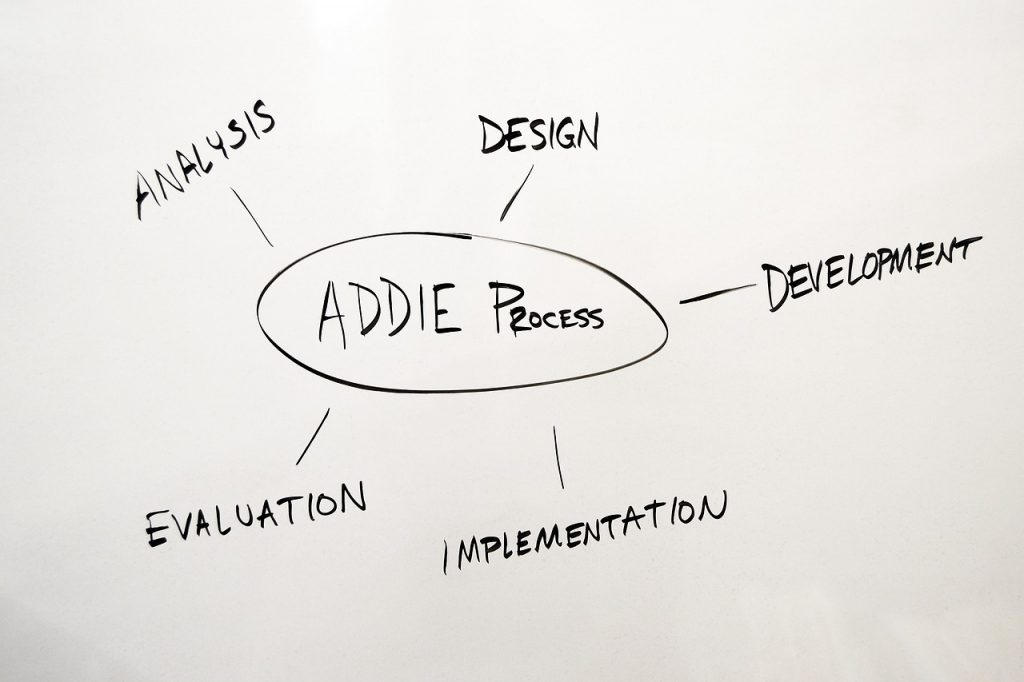
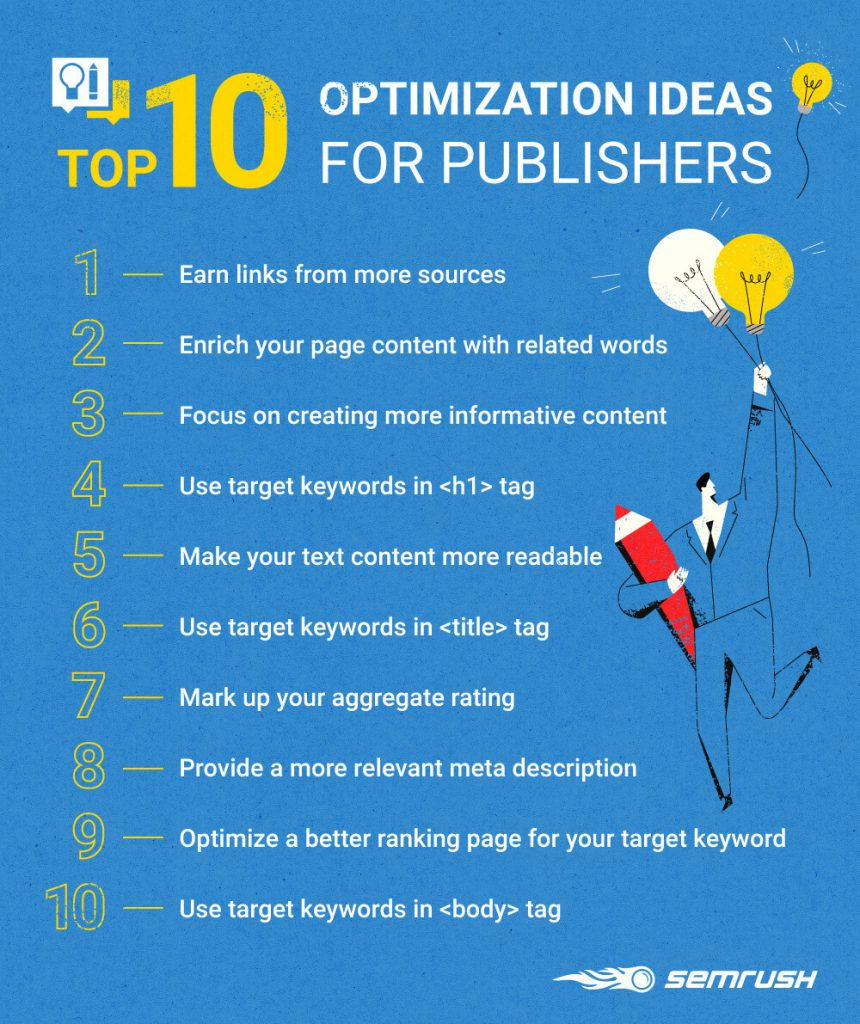
Determining success using KPIs.

Organizations typically measure success by defining a set of KPIs. These are quantitative metrics used to measure your site's progress over time.

However, deciding what these metrics should be is not always easy. A good starting point is the company's overall strategy. Most organizations have a plan that sets out the broad goals they are striving to achieve. This could be an increase in revenue, a decrease in costs, or an increase in market share.

Once you have these broad organizational goals, try to determine how a high-performing website can help you achieve them. This can lead to more leads, fewer support requests, or more promotions on social media.

Finally, turn these criteria into something measurable. For example, the number of leads can be measured by the number of contacts received through the forms on the site. And cutting down on ineffective ad budgets can lead to fewer people calling your company, but increase conversion rates.

In total, you can get a lower cost of attracting a buyer.

Of course, no metric will be perfect... Some people email rather than fill out a contact form, and there is no guarantee that the interruption in calls is solely caused by the site. This is normal. Make your metrics as good as possible, but accept that they will never be perfect. Better to measure something than nothing.

However, don't get hung up on your metrics, as they are often not perfect. They can only be an indicator of success.

Plus, choosing the wrong metrics can hurt the overall performance of your sites. 

To avoid these problems, try to use a combination of metrics that balance each other.

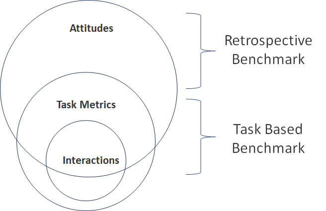
Finding balance in your KPIs.

It is usually worth combining the three areas to ensure balance. It:

  • Usability or UX - ease of use of the site
  • User engagement - time on site, number of views and number of bounces
  • Conversion or CRO - percentage or value of orders

Let's take a closer look at this.

Usability audit.

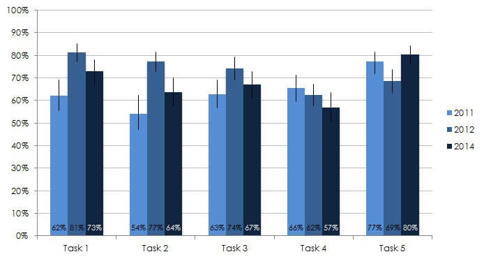
Usability audit important because it will be associated with a wide range of company goals. But how can you track and measure the usability of a website? Fortunately, there are some metrics you can consider to measure. They are taken into account, but not limited to:

  • Level of achievement of success in solving the problem... What percentage of users are capable of completing the tasks of your script on the site.
  • Time to complete the task... On average, how long does it take for a user to complete basic actions on your site?
  • Error rate... How often users make an error when trying to complete a task.
  • System usability scale... A long established survey for measuring user perception of usability.
  • Task progress bar... A metric that combines multiple criteria to judge the overall ease of use of a site.

By tracking one or more of these metrics over time, you can begin to measure whether site improvements are helping your overall user experience (UX).

Tracking interactions. Engagement Score.

Performance indicator

Site performance should be with minimal waiting for pages to load. In truth, our sites need to do a lot more. They should also delight and engage users. We can measure engagement by tracking metrics such as:

  • Minutes of attention... How long does a user pay attention to content such as a video.
  • First impressions... How users react when they first visit the site.
  • Interactions... How often does a user stop on pages, comment or share content?
  • NPS Consumer Loyalty Index... A metric to measure the likelihood that a user will recommend a site to others.
  • Depth of interaction... How many times the user clicks on the site navigation.

Engagement tracking is often aligned with an organization's goals of increasing brand awareness, increasing market share, or other marketing-oriented metrics. However, be careful not to focus on items such as visits, because factors outside the website can significantly affect these numbers.

Tracking conversions. CRO.

Finally, the most obvious metric to track is your conversion rate, or CRO. Most sites exist to convince users to take action. These actions often create tangible financial benefits for the company.

If a website is owned by a retailer or service provider, it is usually relatively easy to track conversions. E-commerce sites can track sales, while service companies track the number of leads.

However, not all so simple. For example, tracking the number of generated leads is not necessarily the best metric unless they are qualified leads. Also, it can sometimes be difficult to determine if they came from a website and not through other means.

It is in situations like this that it's easy to give up the idea of tracking metrics. However, as said earlier, it is better to control something, even if it is not on the 100% for sure. Plus, with a little imagination, you can often track more than you think.

Finally, where possible, it is also helpful to link financial value to these conversions. For example, if a business knows that about one in 10 potential customers generated on a site turns into a paid project and that the average project costs a certain amount, then you can determine how much each of the potential customers is worth to the business. This type of calculation is worth doing as it helps to justify further investment in the site..

As you can see key performance indicators are an important factor in determining if a website investment is profitable for the business. However, while you should always strive to improve these metrics, avoid setting targets for how much they should increase over a period of time.

Beware of setting goals for your KPIs.

Team performance indicators

While KPIs are helpful, they can also be dangerous. This is especially true when the management team begins to set goals related to these metrics.

For example, the management team often looks at the previous year's performance and expects continued or even greater growth in the future. At first glance, this seems reasonable, but in reality it is often unrealistic. Coming up with KPIs can be tricky, so Contact us, if you need help.

Usually, when you first start tracking KPIs, there will be some obvious and simple fixes that will improve the metrics. However, over time, as the web team fixes more and more things, it becomes more and more difficult to move the framework. This would make it unrealistic to see the same or higher rates from year to year.

Sometimes it is possible to maintain the level of growth, but only if management correlates it with an increase in investment, which allows the creation of new functions or deeper analysis

This means that the rate of return on improved metrics is diminishing and could result in negative bottom line for the business.

We should consider KPIs as a benchmark.

As the increase in profits falls, this often leads to a game of blaming each other. In which different groups in business shift the responsibility for shortcomings to one another. For example, the web team blames marketing for not attracting quality traffic, while marketing blames the web team for poor conversions.

Instead, we should consider KPIs as a benchmark. Guided by where we should invest in our sites and how successful our efforts are. They should be an indicator of success, not a goal to strive for.

✔️ What are KPIs?

These are quantitative metrics used to measure your site's progress over time.

✔️ What is User Error Rate?

A quantitative measure of user errors when trying to complete a task.

✔️ What is user engagement?

These are user attention, interaction with the site, first impressions and depth of interaction.

✔️ Should 100% trust performance metrics?

Consider KPIs as a guideline, not as a basis for making a decision.

✔️ Why is user engagement important?

User engagement is highly correlated with overall profitability. Highly engaged users are more likely to buy, come back, and share a product or service with friends.

✔️ What are the five 5 goals of usability?

Understanding the five usability characteristics — effectiveness, efficiency, engagement, error tolerance, ease of learning — helps guide user-centered design tasks towards the goal of creating useful products.

✔️ What are the problems of usability?

A usability problem is something in a product or website that leads the user to an unwanted outcome. It's relatively easy to spot when users have interface issues. Errors are undesirable, but not necessarily caused by interface issues (think about typos).

What is UX Design.

What is UX Design

Designing digital products while delivering an enjoyable experience to people can be challenging but fun nonetheless.

As a UX Designer, I am often in a maze of possibilities when solving problems. And after talking with other designers, I realized that I am not alone, this is part of our practice.

Here I want to talk about the complexity and ambiguity that we face in our day-to-day work. But before that, I want to give you some context and look back at how our profession came about.


Looking back.

In 1993 Don Norman coined the term "user experience" for his group at Apple Computer. Before this role UX There was no design in the industry. The work of a designer was more about aesthetics than business. UX Designers, as we know now, started appearing in the late 90s along with the dot-com bubble, but they were called Information Architects.

What is UX / UI design?

By then, usability and accessibility had become the hallmarks of online products. And organizations began to create jobs for people to take care of those areas.

In the beginning, the day-to-day job of an information architect was to organize information overload and create easy-to-use websites. They were also responsible for conducting usability tests for websites.

Soon, e-commerce companies began to realize that information architects could also help increase sales. Continuous advances in software, hardware and digital technology have made their work inherently complex.

The real UX of Design.

Currently UX Designer work includes more branches. We take into account the end-to-end experiences of people interacting with products and services.

Together with other UX users, we plan and conduct user research. Together with product managers, we explore new strategic business opportunities to determine which products and functions should be built.

We then prototype and test with users to identify problems people might encounter while using our products and then propose solutions.

We work with other designers to turn quick and dirty prototypes into amazing user interfaces.

In cross-functional teams, we partner with engineers to create applications that make them easy to use. Once the products are on sale, we work with data analysts to track user behavior and conduct A / B tests.

Balancing what people want and what the business needs to grow and be sustainable can be a daunting task.

Dealing with this ambiguity is not always convenient, as we often have to deal with difficult trade-offs that could potentially affect millions of users.

Understanding interdependencies in design.

UX Website Design

Digital products carry many interdependencies within and outside organizations. For example, the state of the economy, politics, society, the environment, available technologies can affect the lives of people and, therefore, the acceptance of products by consumers.

Within organizations, you need to quickly create and ship products. This requires broad interdisciplinary collaboration from a range of teams and departments.

Organizational culture influences everything and the challenge, especially in large organizations, is to motivate everyone and work towards the same goals.

The interdependence of all of these factors and the people involved makes product design and development really challenging.

When faced with complexity, it's common to take a reductionist approach and try to simplify things. But the problem is that by doing this, we often exclude things that may be important to some of our clients. When developing a product, we must roughly prioritize, and this is difficult when we strive to be inclusive.

We now understand the need for experimentation, and therefore rapid movement, learning and market adaptation are the keys to product success.

In the digital world, “perfect” performance no longer exists. It used to be that things were more top-down and therefore more predictable.

The products were fully formed, designed and delivered in one go. Today, it is more important to take risks from the start and accept the trade-offs for both the business and the users of your products.

Managing complexity in UX / UI.

Being a UX Designer requires a lot of flexibility. It is an ongoing process of learning, weaning and adapting. Technology is constantly changing and new design tools are coming to the market, but that's not all.

Studying the behavior of people interacting with your products is an ongoing exercise. In addition, as we move from one project to the next, we must quickly adapt to the dynamics and culture of the new teams.

An ongoing collaborative approach can help us deal with complexity and ambiguity.

Involving users as well as employees from different areas of the business in the product development process brings different and valuable perspectives. Listening to people's stories can challenge our own biases, and this is so important to inclusiveness.

Awareness can also come from various industries. They allow our brains to create new extensions of thinking and systemic perspectives on problems.

Working as a team, there is nothing better than doing something visual to create a shared understanding. Concept creation is a powerful way to see the big picture, prioritize, and focus on what matters most. This triggers the imagination when discussing possible scenarios.

Problem solving in UX / UI Design.

Quite often, problem solving requires us to act like detectives, trying to find clues and evidence to solve our mysteries.

  • We conduct various types of research with existing and potential users, as a result of which we go deeper to understand their needs and motives.
  • We start a full investigation from scratch, challenging our own assumptions.
  • We formulate and rethink problems, create hypotheses and test solutions.
  • We base our lines of investigation on whatever evidence we may have at any stage of product development.

The challenges we face require analytical and pragmatic approaches, as well as creativity and imagination. Unlike logic puzzles such as Sudoku or crosswords, solutions are not always accurate. They don't fill the board with perfectly combined numbers or letters within squares.

Since there is often no perfect solution, we have to consider the pros and cons of every alternative or assumption we have.

Once we have considered the various constraints, we can make informed decisions to provide a feasible and viable solution.

Experiment and learn in UX development.

When dealing with ambiguity in UX Design, we have to admit that we don't have all the answers. In order not to get stuck, we can offer experiments in data collection, learning by doing and figuring things out.

We can create hypotheses, plan tests, observe results, and develop solutions. This approach helped the teams in which I worked to develop.

In general, we quickly assemble a group of people into cross-functional teams and decide:

  • What are our hypotheses?
  • What do we want to try?
  • Who's going to try it?
  • How long are they going to try it?
  • How do we know if it worked?

As we experiment, confidence rises and teams become more confident and aligned with common goals. In addition, evidence-based decision making provides process transparency.

It is difficult to predict how Usability Design will evolve. However, there is no doubt that new difficulties and new posts will continue to appear.

Technology will drive change in all aspects of our lives, and ambiguity will continue to bother us if we are not aware of interdependence.

As mentioned earlier, a systematic, collaborative, and experimental approach helped me navigate complexity at work. This allowed the teams to share responsibility for difficult decisions.

So the next time you run into ambiguity, instead of worrying and rushing to “easy” solutions, try to welcome the unknown and energize your imagination with your scenarios and possibilities.

✓ Who is UX Designer?

A specialist who calculates designs based on user behavior habits.

✓ What is Usability Experiments?

This is A / B testing. Two or more design options are taken. Testing shows which design is more convenient for the user.

✓ What data are used for A / B tests?

The UX specialist has extensive knowledge of successful designs. He selects options and tests.

✓ How to choose a UX designer among all designers?

A UX designer is ready to provide you with two design options and test which design will best attract customers.

✓ What exactly does a UX designer do?

The UX designer deals with the entire process of purchasing and integrating a product, including aspects of branding, design, usability and functionality. This is a story that begins even before the device is in the hands of the user.

✓ Is UX design the same as graphic design?

Unlike graphic designers, who focus on aesthetics, UX designers focus on users and how they interact with the product. UX designers want to make people's lives better and, when developing, put the user's needs ahead of their personal preferences.

✓ What is bad UX?

Bad user experience, also known as “Bad UX,” happens from time to time, probably in every company. When we think about UX, we tend to think about digital interfaces. However, this association dates back to the time when the term “user experience” first appeared in the 1990s, when widespread use of the Internet began.

What is Jobs To Be Done in UX Usability.

UX jobs done

One cool framework that, unfortunately, few people know about: Jobs-To-Be-Done (JTBD). It was popularized by Harvard Business School professor and author of The Innovator's Dilemma, Clayton Christensen.

The essence of the approach is very simple.:
here is, for example, Petya. Petya is 30 years old, he has a wife and a child. Petya is hardworking, cheerful and kind. On weekends, Petya goes to the gym, and once a month he meets with friends in the sports bar.

5 minutes ago Petya bought snickers.

Did any of the characteristics listed above affect the fact of the purchase? No, it didn't. Petya bought snickers not because he is 30 years old, but because he was hungry.

The point is that we all constantly have some kind of tasks (“jobs” in JTBD terminology): kill time by standing in line; prepare a healthy breakfast; share your impressions of the trip. When we start using a product, we essentially “hire” it to help us do some specific “job”. The product does not match the person or their characteristics, it matches the problems that it solves.

Of course, the idea of building a product around a problem is not new at all (in fact, JTBD has been around for over 30 years, but it was used mainly in the production of physical products). JTBD just provides a convenient framework and toolkit to work with, that's all. But the difference in team organization, strategy building and feature development is huge.


User stories vs job stories.

Even if you are not an expert in UX, you've probably heard (or seen) this pattern:

As a , I want to  so that 

In fact, this is a user story - a short description of a feature from the user's side. usually based on one of your Identities (you can read more about Identities here, in short - you conduct user researches, analyze online data and create several (typically 5-6) collective users who represent key segments of your audience).

Honestly, I tried several times to use Person and user stories in my work, but I constantly faced the same problems:

  • in theory, Persons should maintain the required level of empathy in the team, especially for those who do not communicate much with users. In fact, no one on the team was able to memorize all the characteristics of even one Person. Everyone remembered something different, and as a result, everyone got a completely different picture;
  • what if your audience is too large and segmented? Everyone has different goals, different professions, different backgrounds - there are clearly more combinations than 6. It is even more interesting when the audience is approximately homogeneous in terms of personal and social characteristics. At this point, attempts usually begin to somehow combine everything into “Lena, a lawyer” or “Vanya, a student” - this means that we begin to make assumptions. Some aspects can be confusing at all: for example, we are making a feature “share on social networks” for a news site. The fact that our person works as a doctor should somehow influence the development of the feature, should we somehow take this into account? Here, for example, I began the transformation of what into why - why would anyone at all share our news on social networks? What drives the user, what is his motivation? And, oddly enough, many persons, when answering this question, were united into one group.

Let's not offend people so much, in general, this is a good tool to "introduce" developers to users. But it is not very suitable for defining product strategy and prioritizing features. Here's a quote from an article by Paul Adams, VP of Product at Intercom (and formerly at Google and Facebook):

“Whilst best in class personas focus on goals (goals are what drive people's behavior) as well as attributes, the reality is that most personas focus on attributes alone, and even goal-driven personas artificially break apart audiences. So critically, personas artificially limit your product's audience because they focus on attributes rather than motivations and outcomes ”.

Thus, we smoothly approached the job stories that Intercom invented. And the bottom line is that the focus shifts from personal characteristics to context:

When  I want to  So I can 

Let's compare:

As a 30-year-old Petya, I want to eat something tasty, so that I was no longer hungry.

When I only have 2 minutes to grab a snack between appointments, I want to eat something that is easy, quick and raises my blood sugar, so I can hold out until lunchtime and keep my working mood.

Do you feel the difference?

Job story in action.

UX-Usability

Now let's take a closer look at how to compose a job story.

We have, for example, a gym where we want to increase sales of monthly subscriptions. First, let's look at the persons (the description is rather arbitrary, in reality it is much more detailed and detailed):

  • Masha, 30, is a mother of two. Masha has recovered after giving birth and wants to get in shape, but she can only do it twice a week. In fact, she does even less often, often skipping workouts. Masha is a philologist by education; in her free time she likes to draw and read books of art;
  • Nikita, a 25-year-old athlete, is a regular at our gym. Nikita is a student at the Faculty of Management, he has a lot of time and not a lot of money. Nikita loves to ride a bike and go hiking with friends.

In what case will such descriptions be useful to us?

For example, for targeted advertising. If we want to attract more Masha or Nikita - please: set the campaign settings in accordance with certain characteristics of our people and wait.

Are they suitable for development, especially innovative?

In my opinion, not very much. A persona is some kind of end result of research and our work; this is the audience that we already have. Focusing on people, we artificially limit our product, we do not develop features for new, potential users. Again, by focusing exclusively on the "oldies", improving the product for them, we are out of the competition. Why? Because we don't think about other ways to solve the problem of our users. We think about how they see this solution and polish it up - instead of radically changing the approach and going through the solution options.

Relatively speaking, we can build an ultra-modern gym with touchscreens and a children's corner - and still “give” some of the users to a mobile application with workouts or a home exercise bike.

Let's get back to our Masha. Here's an example of a job story that might have happened:

When I play sports in the gym, and I have small children and I have no one to leave them with, I want them to be supervised so that I do not worry and exercise calmly for an hour.

Is it important here that Masha is 30 years old? That she has two and not one child? What is her education? And what is it Masha, and not Anya? No, only one characteristic comes to the fore: that our user has small children. In job stories, this is part of the context, not a description of the user - simply because the context may contain completely different users. In the example with children, this could be Masha, or maybe Nikita, if his older sister went on a business trip and asked to sit with the children, but he does not want to miss a workout.

The easiest way to understand this is Uber. It seems like there are definitely two specific persons here: the driver and the passenger. In fact, this characteristic is only part of the context: depending on the situation, the driver may be in the passenger's seat, and vice versa.
If we are talking about a candy store, and the context “I want to spoil myself with sweets occasionally after a hard day or a successful project,” both Masha and Nikita and diabetic Misha, vegetarian Alisa and dieting Petya can get here. We do not think about what separates our users, but what unites them... Thus, the features that we make and release receive more coverage.

Persons are definitely much better than nothing. Moreover, many successful companies still work with this framework and feel great. In any case, job stories are just another cool way to get a different perspective on your product. Persons let you look at your users under a magnifying glass, but they do not answer the question of why they continue to use your product - and why new ones will come after you release the feature. In my picture of the world, everything looks something like this:

  • in general, it is important to understand what your current audience looks like - this understanding comes after regular user researches and work with audience figures;
  • but specifically before developing a feature or product strategy, you need a job story.

How to do research for a job story.

So, let's say we are imbued and want to write a good job story. Where to begin? From research, of course.

Most of the current research focuses on the moment of product consumption, while job story research tries to understand when and in what conditions the client got the first thought about buying the product (that is, what happened before they started using it). The researcher is based on the assumption that four forces act on the customer at the time of the purchase decision:

  • dissatisfaction with the current situation (“push”) - “This gym is open only in the morning, and I want to work out in the evening”
  • attractiveness of the new solution (“pull”) - “Another gym is open around the clock”
  • anxiety that something might go wrong - "What if there are too many people in the new gym?"
  • attachment to what is - "I have been going to this gym for a year and I know all the coaches."

Actually, the main task in such an interview is to identify these four factors. At the same time, it is very important to understand not only the rational, but also the emotional aspects of the decision (conditionally - “did it rain when you made the purchase?”):

- Which gym did you go to before? How did you know about him?
- Tell us, what kind of life did you lead at that time? How often did you experience stress?
- Tell me about your old gym. How often did you train? Describe in steps what happened after you opened the front door.
- What made you especially upset in the former gym? When did you start thinking about looking for something new?
- When did you first hear about the current gym? Did you have multiple options or only one?
- How long did it take you to make the decision to transfer? What was holding you back from buying?

And so on. A very important point: you need to talk not with the user, but with the buyer; the person who made the purchase decision. That is, you should not interview the child whose parents bought a gym membership, but just the parents.

Why all this and what does it give us?

People are inert by nature. In most cases, they will continue to use their usual solution, rather than research the market and look for something new - simply because they are already okay. Something out of the ordinary must happen for me to stop grabbing coffee at my favorite coffee shop.
And it is very important to understand that users are not buying your product, they are switching to it from something else. There was a previous gym before the new gym. Before the previous gym, I had exercises on the mat in the morning. Before the rug, there were burgers and ice cream at McDuck (this is an indirect competition, more on that later). The cost of switching from one product to another is determined by habit and satisfaction, multiplied by fear of change. And it is critically important for you to catch this moment of internal struggle and nudge the user in the right direction.

When the “work” of the product ends.

Products do not solve isolated problems, but problems that occur in some kind of workflow: there is what happened "before" and what will happen "after." That is, in this way, a “working” product has a start and an end point. The question is how to define them correctly.

If your product does too little, in the eyes of the user, it isn't worth installing (much less paying for it). If the product does too much, it will conflict with pre-existing workflow elements that are fine with the user.

So where is the golden mean?

Let's take a look at a simple example. Let's say you're writing an alarm clock application; in this case, the workflow might look like this:

  1. User pins Instagram in the evening
  2. Realizes that it's too late and it's time to sleep
  3. Sets the alarm to 7
  4. Asleep
  5. Wakes up, goes to the kitchen for a drink
  6. Asleep
  7. The alarm clock rings at 7, the user adjusts it to 7-30
  8. The alarm clock rings at 7-30, the user gets up
  9. Turns on the radio
  10. Doing exercises.

Your product's “work” should begin at the point where you can add value to the user. For our example, this is most likely step 3. We, of course, can get in earlier: for example, if the user usually gets up at 7 am, and already 12 pm, and the phone is active, our application will send a reminder: cat, do you want set an alarm and go to sleep? We can go even further: make a fitness bracelet that will track the user's heart rate and activity and recommend the best time to go to bed (and wake him up, accordingly, also at the best time to get up). Do you need it? Does the user experience “pain” in line with the scope of research and development? This is what the product team needs to understand and decide at the very beginning.

And when should the “work” end?

When:

  • the next step in the workflow has clear market leaders and you don't want to compete with them
  • the next step in the workflow can be done in a million different ways and a million different types of users
  • at the next step, our audience is radically changing
  • the next step will not add any value to the product.

Competition in the context of JTBD.

What is UX

Some time ago I wrote about the BVG company, which is a de facto monopoly in the field of public transport in Berlin. BVG spends a lot of money on advertising - the question is: why does it do this, if already all metro, buses and trams belong exclusively to it?

If you look at this question from a JTBD perspective, the answer comes naturally. The user's “job” in this context is to get from point A to point B, and not use public transport. And here BVG turns out to be no monopolist, but only one of the market participants - along with:

- bicycles
- bicycles / scooters for rent
- taxi
- own cars
- car sharing
- yes, even walking.

JTBD allows you to take a broader look at the user's problems and identify your real competitors.

Direct and indirect competition

With direct competition, everything is clear. But there is another kind of competition that everyone forgets about.

Example: Petya loves burgers and wants to eat only burgers, but at the same time, Petya wants to be muscular and athletic.

That is, conditional BurgerKing and FitBit sell completely different products and solve different problems, but fight for the same user. This is indirect competition.

Direct competition - competition for "work"
Indirect competition - competition for "result"

TopUser.Pro works for the result with all parameters being equal!

Good luck with your JBTD in depth!

✓ What is JTBD

This is how to satisfy all the needs of the buyer.

✓ How the JBTD principle works

Provide the customer with the level of service they only dream of.

✓ Where the JTBD principle is used

All successful companies use the Jobs-To-Be-Done principle. 90% companies who don't use it go bankrupt.

✓ Why does the Jobs-To-Be-Done principle work?

Due to the lack of market monopolies. Whoever serves more, earns more.

✓ How should the performance of your product relate to the personality of your client?

Your client wants your product to reflect their perception of the world around them. By studying the work your product does, you will better understand your customer's personality. By examining the personality of your client, you will discover what kind of work he is trying to do.

✓ How to use JTBD?

Identify the work that customers are trying to do.
Define the categories of work to be performed.
Identify your competitors.
Create job applications.
Prioritize JTBD capabilities.
List the expected JTBD results.
Create reports of results.

✓ What is JTBD framework?

A work execution structure is an approach to product development based on an understanding of both a client's specific goal, or "job," and the thought processes that will lead that client to "hire" a product to get the job done.

How to add social icons to your website.

Social networks

From a simple link to an embedded feed, millions of websites are integrating into social media.

Why not? This is perfect.

The goals of social media marketing are to promote content, serve customers, and build relationships. 

Thus, you must connect your site to social media in every possible way.

There are quite a few options for connecting a website to social media. networks. 

The five main types of social media integrations are:

  1. Social Icons Networks
  2. Social Share Buttons
  3. Facebook social widgets
  4. Single sign-on (allows visitors to create a new account or sign in using social credentials)
  5. Built-in social channel

There are thousands of best practice articles and practical tips for each of these options. Therefore, instead of another guide, we show how NOT to connect social networks to the website.

Sometimes social media integration is awkward, distracting and ineffective.


1. Do not put social icons in the header of the site.

Website headers have big colorful social media icons. And because they are colorful, they are often at the top of the visual hierarchy, the most visually visible element on a page.

Imagine that you are going to a store, and the largest sign says "exit". Would this be helpful? Probably no. Then why are there big exit signs on every page of your site?

Don't encourage your site visitors to leave. Don't invite them to leave your site.

Sending a visitor to a social media platform gives them the opportunity to profit from a billion dollar company that is fully focused on retaining and monetizing that visitor. Is this good for your marketing?

This is how it looks in the header:

Social icons

A little research on web design standards found that in 2015, 26% of the top marketing sites had social icons in the header. In 2019, that number dropped to 20%. This is going out of style.

The best way to add your social icons.

We recommend that you move them to the footer and gray out them. Here they can be found by people who want to follow, share and mention you. And they will not motivate visitors to leave the site.

Gray social media buttons

Note that the email sign up button (a more valuable interaction for the brand) is more visible. Social media buttons (which are less significant to the brand) are less visible.

This is not legal advice, but ...

Twitter doesn't want you to spoil their logo. 

This may in fact be a trademark infringement of those companies, as you are modifying their logos, which are registered trademarks. I have never heard of any legal action.

Social icon

What social icons do your visitors click most often?

Few people ever check, but the question can be answered through Google Analytics.

By default, GA only tracks movement from page to page, not every exit from the site. But if you set up event tracking for exit clicks, you can see which ones are clicked on any page. Here is the URL of each click for each exit from the website from our home page.

Social media clicks
Percentage of clicks on icons for each social network

Your social media icons are like a survey showing which social media your audience is using.

Where is the best place to add social icons?

Aside from the footer, here are three of the best, most effective places to invite visitors to follow you on social media.

  • On the vacancies page. Visitors to this page are motivated. They are professionals looking for work. Let them know you're posting jobs on social media and invite them to follow you on social media. networks.
  • In the blog. Share buttons. But blogs can do even more to grow your social media. pages. Try writing a text call to action and motivating your visitors to subscribe to your social media pages.
  • On the thank you page, Thank you page is a great way to get more value from the same visitors. They became a subscriber, client or job seeker, why not offer them something else? Add a CTA (Call to Action) and encourage them to follow your brand.

2. Don't mess with dead accounts

Websites all over the place link to social media accounts that are barely active or completely dead. It's like a broken link or a disconnected phone.

So when should you add a social media icon?

When this social network is a key part of your internet marketing strategy. Before adding a Facebook or Twitter icon to a new site, ask yourself two questions.

  1. Do you post content there all the time? (active publishing channel)
    The social network has at least as much relevant content as your website.
  2. Do you communicate with people on this social network? (active network channel)
    You are not just present, but you are communicating with people, communicating and building relationships. If someone asks a question, you answer it.

The answer must be yes for both. If not, postpone social media integration until you have a social media strategy. It is much better not to have icons than buttons that lead nowhere.

The next question is where to put these social icons?

3. Don't add share buttons to service pages.

Have you ever shared a service page? Have you ever seen someone share a service page? This almost never happens.

The job of a service page is to turn visitors into leads. Social media buttons are just distracting, especially if they're big and bright. They add visual noise, but not value, so they should be removed. Cut them out and remove the WordPress plugin that added them.

UX advice. Don't add share buttons to service pages

What about buttons on e-commerce product pages?

Do people ever share products? Yes, but almost never. When we looked at an e-commerce website and compared page views (Google Analytics) to social promotions (Buzzsumo), we found that promotions like this are rare.

Only when the audience is passionate about the product are there any promotions at all.

In the Vienna Beef online catalog, the most popular products are divided by about 1 in 1000 visitors. And these promotions are almost all on Facebook.

Even a great product is shared by 1 in 1000 visitors

With this in mind, we designed the share buttons to be less visually visible than the add to cart button. Because the goal is sales, not stocks.

We found that the exchange of information between 1 and 1000 visitors (this is 0.001%).

Therefore, set very low expectations for the stock on the product page and be very careful not to distract visitors from the buy button.

4. Don't show low numbers.

Social proof both ways. If the numbers are large, this is positive. If they are small it is negative, what does it do when the content looks unpopular? Sad.

Don't be discouraged ... but keep an eye on your widgets.

Don't show low numbers on social icons

Choose your widgets carefully. If stakes are low on some networks, you can only show one cumulative number for all social networks. This is what many do. Or just use widgets without numbers.

Simpler widgets have another advantage. They load faster.

5. Beware of Heavy Javascript.

Social icons are almost weightless. But social media widgets (share, subscribe, etc.) are created using Javascript. And in order to download, they have to communicate with servers on Facebook, Twitter, LinkedIn or Pinterest.

These extra requests can increase the page load time by half a second or more, especially for fancy widgets.

There are several ways to avoid bloating the code that social widgets create:

  • Use simple widgets ... avoid those with counters (promotions, fans, subscribers).
  • Use ultra-lightweight share buttons
  • Load social widgets using asynchronous Javascript so they don't have to load them one at a time ... or just program the site to load after the rest of the page has already loaded.

Worried that social widgets are slowing you down? Audit your pages with Lighthouse in Chrome Dev Tools.

Audit result

Make your brand social and representative on your website. And connect your site to the networks where you communicate. These are useful actions.

Link to social networks where you are active

Place social widgets so as not to distract visitors or slow down the site

Did you find this helpful? If so, you can join me on facebookwhere I publish interesting articles or subscribe to Youtube channel.

Based on the article: https://www.orbitmedia.com/blog/website-social-media-integration/

<


What is UX?

The rundown provided by Don Norman Jacob Nielsen defines UX as:  "All aspects of the end-user interaction with the company, its services and products."

How do I test the UX?

Different terms are used to describe verification methods:

  • тестирование UX.
  • тестирование удобства использования, которое на самом деле является лишь частью тестирования UX.
  • verification of user experience. 

User testing methods.

Such analysis is the study of the use of a product with real people working with it. 

There are two main types of user testing:

  1. Moderated test.
  2. Unmoderated test.

1. Moderated user test.

In this verification, the user performs the assigned tasks in relation to the product or service, while the researcher or moderator observes it in real time.

advantage of testing with the presence of a coordinator and observers in the office

At the same time, the moderator guides the tested users on tasks, explores, dives deeper into problems and receives feedback immediately. 

The advantage is the ability to investigate the user problem in real time, but the disadvantage is bias and simplification.

Pros:

  1. Check users during the current test for more information.
  2. Feedback and emotional responses immediately.
  3. Good quality samples with tight control of user activity.

Minuses:

  1. Hiring a lab or studio can be expensive.
  2. You may not have the equipment to run an internal moderated test.
  3. It will take time to type, pre-validate, run tests and analyze their results.
  4. Limited to a few locations unless remote moderation is available.

2. Unmoderated user test.

Participants are assigned a series of scenarios, tasks, and questions. Verification is usually performed remotely. For example, users are at home.

advantages of ux remote testing

Pros:

  1. The ability to recruit a group of users for testing from all over the world.
  2. Easily work with large sample sizes.
  3. Minimum costs due to low compensation and no need for additional services.
  4. Fast!
  5. Known upfront costs and good value for money.

Minuses:

  1. Sample quality can be poor if recruitment is not correct.
  2. Unable to observe test participants during a review session.
  3. If a user is stuck in a test, you won't be able to steer them in the right direction.

3. Five-second usability tests.

Popularized by UsabilityHub, this method is an estimate of the first user impression of the clarity of your site in 5 seconds. Whether the content of the site is clear depends on the quality of the copywriting.

Five-second usability tests are best for answering the following questions:

  • What is this site used for?
  • Is it easy for a visitor to get to know the company?
  • What are the benefits of this service or product?

How to create a five second test:

  1. Design what you want to use in your usability test. In most cases, this is a home page, landing page, or product page. You can use the Google Chrome extension to take a screenshot.
  2. Upload your design to a usability testing service like UsabilityHub.
  3. Ask usability test questions. 

Five-second usability tests are a great way to provide qualitative as well as quantitative data to generate results.

4. Method: Sorting the cards.

The purpose of card sorting is to understand how users or customers find information, navigate the system, label information, and organize it.

sorting cards for UX testing

This popular technique is used when designing or evaluating a site's information architecture and improving navigation. Users are given cards with sketches of the information structure of the site, and they arrange them in the sequence that seems logical to them.

To test the usability of card sorting for your website or application, you can use:

  • real cards;
  • paper stickers;
  • notes;
  • online card sorting software.

There are 2 types of classification:

  1. Open card sorting:  members are free to organize content topics into groups that make sense to them. Participants then tag these topic groups without predefined classifications.
  2. Sorting closed cards: participants sort content topics into predefined categories.

5. A tree-like method of usability testing.

This usability research method is used to assess whether themes and elements are easy to find on a website or application.

Using a simplified text version of the site structure, the user navigates through a series of top-level topics by selecting a heading and then a list of subtopics. The user completes the task when they are sure they have chosen the correct theme.

How to use tree tests:

  1. Create your own tree. This is the structure of your site.
  2. Write a series of "find" problems. For example: you bought a new watch and you need a protective case. Where would you like to buy it?
  3. Recruit participants for your test. In most cases, you want to engage the user of your website or product.
  4. Ask participants to complete your test items.
  5. Analyze the final results of your usability test.

Research can be done on an existing site as a basis. They can be compared with the results of each stage of usability testing - Stephen Byrne.

6. Replays of sessions.

Session replay is not an audio-video recording of a user's journey and actions on your site. It includes user interface actions such as scrolling, clicking, and interacting with forms. This is usually an anonymous way of testing the usability of your website.

It is great for identifying user behavior and trends. It has an advantage over user testing. The participants in the audit do not know that they are being watched. In this way, users demonstrate their actual behavior on the site.

As with Google Analytics, to get started with session replays, all you have to do is install a javascript snippet on your site to start collecting data. 

7. Polls.

Working in tandem with other tests, surveys are great for comparing qualitative and quantitative data and feedback from your users.

With the help of survey tools, you can collect information from your users at the moment when they performed certain actions on the page.

For example: a user just purchased an item: send them a motivated survey to find out how difficult or easy the buying process was.

a satisfied user leaves a review

8. Heat maps.

This is a graphical representation of where users clicked, scrolled, hovered over, or navigated through pages.

display of user movement on the site heatmap of screen touches

Determine where multiple members went to a particular page. On a heatmap, top-level click areas are usually shown in red, and interaction levels are usually indicated in orange, yellow, green, and blue.

Also, a scroll heatmap shows the percentage of users who scroll to a level or area on a specific page.

There are Eye Tracking heatmaps. Similar to how heatmaps work, eye tracking maps show where users are most likely looking on a web page. 

9. Feedback from users.

You can provide the ability for users to provide UX or usability feedback when they feel the need to do so.

Popular tools like Hotjar and UserSnap offer the ability to add a widget to your site, which allows the visitor to select the area of the site they want to give feedback on.

This will allow the user to be open and honest about certain elements of your site that affect the UX. However, the feedback received is not as detailed as custom tests or session replays, and can vary from page to page, limiting the sample size.

While the amount of data may be small, you can collect information about the sentiment and language use of the target audience. Then change the spelling of the text to match the languages of the site visitors.

10. A / B testing.

This is the best way to accurately measure and see if your changes are positively impacting the metric that matters to your UX.

You can try different designs and layout of site elements. An A / B test will show which ones resonated more with users.

AB testing shows which of the two design options is more popular with users

11. Biometric UX Research.

The ability to truly understand how a person feels while using a web resource is a UX researcher's dream.

Are they disappointed? Do they like him? 

Being able to accurately understand the user's feelings during the experience helps us optimize and improve our UX.

Biometric research encompasses many research methods, including:

  • Tracking  look : the ability to follow the movement of the eyes of participants. For what they are looking at, by looking, how long they are looking, etc. Something like a map of clicks and heat, but this is the observation of a person from the outside, not a program.
  • EEG (electroencephalography):  measuring the electrical activity of the brain using electrodes. Great for displaying emotions on the fly and tracking cognitive activity.
  • GSR (Galvanic Skin Response):  Conductivity is measured in the small amount of sweat produced by the pores on the skin. Provides insight into your emotional state.

Conclusion: User Testing Checklist.

  1. Start by defining the results and goals you want to achieve through user experience testing.
  2. Ask what questions are important to answer in the user test to achieve your results or goals.
  3. Choose a UX research method that answers your questions. Likewise, be sure to choose a method that suits your time, cost, and other resources.
  4. With a usability tool or service, run a UX test with real human testers and collect qualitative feedback and quantitative data.
  5. Analyze test data, site design.

Informative UX tests for you!

Based on materials from the site: userpeek.com.

✓ What are the main directions of UX tests?

They are behavioral - they show what users are doing and "relational" - they let them know what they like and what they don't.

☆ What is a focus group as a usability test?

Several users and a moderator get together to discuss ideas for the design and architecture of the site.

✓ How else can users participate in the creation of the site?

They can write on paper how they see the structure of the site and what will be convenient for them.

☆ When is testing with user diaries used?

Users write in a diary when and under what circumstances they thought about the product being developed. This helps to understand the context of its use.

☆ What is usability testing in UX?

Usability testing is the practice of testing how easy it is to use a design with a group of representative users.

☆ What is website usability testing?

Website usability testing is the practice of evaluating the functionality and design of your website by observing the actions and behavior of visitors as they perform certain tasks.

☆ How to write a UX test case?

When writing task scripts, you should follow a few general guidelines. The tasks must be realistic. If the user can identify with the situation, they are more likely to be involved. Avoid prompts and be specific.

Information design principles.

Applications and principles of information design. User UX strategy

User-centered design is focused on meeting the end user needs.

Data - both quantitative and qualitative - serve as the basis for deciding on the direction of design. Understanding what the data tells you affects your information architecture, characters, user flows, design interface and many other aspects of user interaction.

Having multiple dimensions of data enables companies to innovate, and multidimensional strategy requires consideration of the design problem from different angles. 


Use a multidimensional perspective for your design strategy.

Our 8 methods of UX analysis fall into four categories: user perspective, business perspective, expert perspective, and technical perspective. Each offers a unique perspective that allows you to truly imagine the design process.

design process

8 methods of analysis UX.

1. Website and device analytics

It is very important to understand where your target audience "lives". What is their preferred digital environment? Technology is constantly changing, and your behavior and preferences users will also change.

Device and website analytics reveal important information about click paths, demographics, device preferences, major browsers and technologies.

Example: Analytics provides insight.

Flurry Analytics is one of the tools we use to analyze user behavior on mobile devices. In the example below, we will follow how users are promoted through a mobile app. 

Compared to the other version of the mobile app, we were able to see that the preferred version had a bounce rate of only 7% compared to a bounce rate of 23.5% for the other version that ran full screen ads.

full screen advertising

2. Business and sales analytics.

Understanding business data and sales is also an important part of UX. What are the most beneficial strategic steps? What can be revised?

Business and sales analytics enable companies to measure their success and assess how to improve specifically.

Example: Sales data shows key demographics.

Business and sales data reveal important information about your product and users. Despite the fact that the webstatistics showed a more balanced demographic, with one customer's sales data showing that their customer base was predominantly older. This data, shown below, was important to consider when it came to brand redesign.

customer base

3. Comparative analysis of competitors.

Comparative analysis competitors will identify opportunities for improvement or differentiation. It also indicates areas where there are benefits.

By examining qualitative data (observations, discussion of trends, etc.) and quantitative data (concrete numbers and statistics supporting a qualitative assessment), the team can make recommendations to satisfy - and ideally surpass - the steps being taken by the competition.

Example: usability analysis.

Below in the section "Competitive performance of competitors" was analyzed the number of "steps to checkout" similar e-commerce sites.

After making a comparison, we analyzed how to make the steps easier and shorter to reduce dropouts.

competitive performance

4. Principles of UX benchmarking.

Timeless principles exist for a specific reason - in many cases they have been proven to improve products.

Principles UX Benchmarking measures a website or product against other principles and myths and uses them as a metric to determine how to improve the design. Principles and myths point out what works and what doesn't. They act like a litmus test for what constitutes sound design.

Example: comparison with specific principles.

An example of a principle is that "scrolling is faster than paging". Each time the user clicks on a new page (called "paging"), the refresh time averages 6.5 seconds. The user can scroll through one long page (consisting of several sections of the page) in a matter of seconds, instead of wasting a lot of precious time navigating between pages (for example, spending 26 seconds viewing 4 pages).

Using this principle as a guide, we will provide guidance on how a client can make their website more scrollable and crawlable.

How to measure website conversion. Website revenue and sales.

5. UX checklists and heuristics.

At Fresh, we use both a 150-point checklist across 10 categories and a variety of heuristic structures used to analyze whether websites are high-quality. These peer reviews serve as a concrete assessment of how to improve your design.

Examples of key elements analyzed include whether the content is relevant, whether the included advertisements are professional and relevant, and whether the branding is consistent across the site.


6. Assessment of UX trends.

UX Trends Evaluation identifies new UX directions and evaluates whether your product can benefit from more advanced designs.

The innovation is exciting. However, in user-centered design, it's important to focus on the ultimate needs of the people using your product first. As UX expands in new, innovative directions, analysis should also prioritize your target users and their needs against relevant trends.

Example: The trend of increasing screen size and resolution.

In addition to dimensions screen mobile devices people use larger screens with higher resolution to access websites. Without designing with these habits in mind, your experience can look and feel low-level. The fact that screens are getting bigger and bigger with higher resolutions is important for analysis and accounting.

screen dimensions

7. Technical analysis.

What integrations are easy to do? What restrictions and limitations do you need to consider? Maximizing design effectiveness is achieved by understanding the implications of design decisions when you understand and use technology.

  • Tech Stack Limitations - What aspects of your tech stack will make your site the most effective?
  • Performance limitations - will design slow down performance?
  • Integration restrictions - with which systems can you integrate your site to improve performance?
  • Back-end CMS / Admin Constraints - What are the right content management systems to make maintaining your website as easy as possible?

8. Analysis of the process.

The analysis of the process that the user goes through when using the system allows you to paint a picture of the problem before developing a solution.

  • Understand the challenge and design with empathy - Improving a process or system requires understanding how it works for users.
  • Think over the flow and focus - the core of a web application or mobile application is the flow of users. Ask stakeholders and users if it makes sense to tailor the experience to their needs.
  • Look at the picture generally. High-level thinking can help you understand the details of a project (such as the layout of data entry fields) and help you think broadly about what users are trying to do and how you can help them achieve your goal. ,
  • Consolidation, separation or reduction of processes. By documenting the processes and stages that the user goes through, it is possible to determine which stages should be consolidated and which should be split. A system that automatically integrates information will be more user-friendly.

Example: process analysis in healthcare.

One of our healthcare clients approached us to create a CRM tool to manage the administration of their benefits. The analysis of the processes allowed us to answer how to create a minimum viable product that would make their core processes more efficient.

health care tools

Conclusion.

Data - both quantitative and qualitative - tells about what works for users, stakeholders and businesses.

Ultimately, analysis adds clarity and justifies important decisions with confidence. As opposed to making design decisions that have no evidence or justification, can be stumbled upon by chance, UX Analysis provides a multidimensional perspective to transform your design strategy from acceptable to exceptional.

Because the data helps understand the strategy that leads to more meaningful user-customer interactions, there is value and return on investment by including analysis in the design process.

✓ What is UX?

UX stands for User Experience. UX studies what actions the user takes on the site and what motivates him to take actions and purchases.

✓ What is website technical analysis?

The technical analysis of the site examines the speed of the site, the stability of the site and technical errors of the site.

✓ Does an internet marketer need business analytics for sales?

I need it. Business sales analytics allow marketers to measure their success and assess how to specifically improve a product.

✓ What are the UX trends this year?

Now there is a decrease in the amount of navigation and an increase in product information.

✓ What is the difference between design elements and principles?

Design elements are the parts that define the visual appearance, tools and components that a person uses to create a composition. Design principles relate to how a person uses elements to create a visual image and convey a message.

✓ How are design elements and principles used?

Design elements and principles are the building blocks used to create a piece of art. Design elements can be thought of as what makes up a picture, drawing, design, and so on. Design principles can be thought of as what we do with design elements.

✓ What are the elements and principles of logo design?

5 principles of logo design.
Simplicity.
Memorability.
Durability.
Versatility.
Conformity.

Usability testing of sites.

Testing

From e-commerce to banking apps and healthcare systems and everything. Users expect it to work with any interaction, on any possible platform and operating system.

Yet despite the need to deliver a digital experience, Gartner research shows that only 18 percent of companies provide the desired customer experience.

Much of this gap between expectations and reality is that digital businesses depend on the quality of their software and applications. And they often don't work properly. 

In an era where digital transformation is so dependent on quality software, testing has never been more critical. 

However, over the past decade, testing has been focused on verification. That is, do programs and code work? Not confirmation, does it do what I expect and want?

As companies progress on their digital transformation journey, it's critical that testing focuses on answering the last question. 

Software testing should be about simply verifying that the application meets the technical requirements and providing the best user experience and business results.


https://www.youtube.com/watch?v=-apSmGKko78

Verification confirmation.

Website testing

Testing should move from a proven activity to a continuous quality process. 

The goal is to understand how the technical behavior of the application affects the customer experience and conversion for business. Moreover, it is about identifying opportunities for improvement and predicting the impact of these improvements on the business.

Verification testing simply verifies that the code meets the specification provided by the business. These specifications are intended to be ideal and replicate exactly how users interact with and use the software.

However, a spec developer simply cannot know how users will react to each piece of software or write down anything that might affect the customer experience. 

Even if they were, it would make software development excruciatingly slow. Taking this approach, it is assumed that validation was also performed as a result. However, this is more of a mirage than a reality, and this led to the fact that usability ignored in terms of software testing.

Companies should move away from the outdated approach to testing only if software is working. Instead, adopt a strategy that evaluates the user's point of view and provides ideas for optimizing their performance. 

If you care about User Experience and you care about business results, you need to test the product from the outside, as the user does. Only then can you truly appreciate the user experience (UX).

A user-centered testing approach ensures that UI bugs, bugs, and performance issues are identified and fixed long before the application is up and running. And they cannot have a negative impact on the quality of customer service and, possibly, the perception of the brand. 

Fast, reliable websites and apps increase engagement, generate revenue, and drive positive business results. Ensuring these goals are met must become an integral part of modern strategies testing.

For example, a banking application can meet all of the specification criteria. But if customers are required to add their account details every time they want to access their account, they will quickly lose patience. Will stop using the app and eventually go to a competitor. 

This is why companies need to rethink how they evaluate software and applications and reorient their attention to meeting the expectations and needs of its customers.

If companies want to close the customer gap, they need to rethink their software and application ratings. 

Validation testing should be a fundamental element of testing strategies. However, organizations need to start testing the user interface and modernize their approach. Then they can keep up with the pace of DevOps. It is an important driver for digital transformation.

Historically, the only organizations to conduct validation testing have been teams with experienced manual exploratory testing capabilities. Search Engine Testing measures functionality, performance, and usability, and takes into account the full range of tests. 

However, it is not transparent, of high quality, and not reproducible, and it is difficult to incorporate it into an ongoing development process. Manual pretesting is costly at scale as it is time consuming and experienced testers are limited.

Client-oriented testing.

Client orientation testing

Client-centric testing is a new approach that automates pre-testing for scalability and speed. 

Basically, customer centric testing focuses on user experience, not specification. It also helps speed up traditional spec-based testing. 

Artificial intelligence (AI) and machine learning (ML), combined with model-driven testing, have opened the door to on-demand testing.

Intelligent software testing automation enables companies to continuously test and monitor end-to-end digital user experiences. 

It analyzes applications and real-world data to automatically create and execute custom paths. It then creates a model of the system and user paths and automatically generates test cases that provide robust coverage of the user experience as well as the performance and functionality of the system.

By automating product feedback, you can quickly find problems and resolve them. Once that happens, smart automation can go even further. AI builds a model by observing and understanding the system. He looks for bugs related to application, testing and development to understand the risk.

AI evaluates manufacturing to figure out what matters to the business. This information about risk factors and business impact directs testing to the right place. In contrast to the speculation testing mirage.

AI and ML technologies recommend running tests on a continuous basis. Teach systems and perform intelligent monitoring that can predict business impact and enable development teams to fix problems before they occur. 

These cutting-edge technologies are core components of customer-centric testing, but another critical element is needed: human intelligence.

The human factor in Usability.

Customer-centric testing does not mean the death of a tester. Machines are great at automating processes and correlating data, but they are not capable of replicating the creative part of testing. 

This includes interpreting data into real human behavior and developing hypotheses about where the problems will be.

The tester must provide hints and directions as machines cannot replicate their experience and intuition. Human creativity is essential to manage the client-centered testing process.

Automated analytics and test products provide massive amounts of data about how a user behaves in a human-application interface, but this requires the person to understand why the person took this action. 

The person will set thresholds for errors. For example, it will pull the levers and direct the algorithms. Customer-centric testing is only possible with human testers supplemented with modern technology.

UX and testing.

Usability testing

Digitization is rapidly changing the way businesses and customers interact with each other. Understanding and optimizing customer experience and ensuring that applications meet business goals are now critical to digital business. 

Practices that simply confirm that software works must be removed, or organizations risk falling behind their competitors.

A new approach to testing is essential. The combination of AI-based testing combined with ux-usability experts in automation management makes it possible to test on demand. 

If businesses want to close the gap with the customer experience, they must turn around and see the performance of their digital products through the eyes of the customer. 

If a sites and information really rules the world, you need to make sure that it pleases your customers and doesn't just work.

✓ What is automated testing?

This is the verification of the application for compliance and their user experience assurance.

✓ What is verification testing?

Checking for compliance with the specification code provided by the business in the terms of reference.

✓ What is customer-centric testing?

It is an approach that automates pre-testing for scalability and speed. 

✓ What is validation testing?

Manual exploratory testing that assesses functionality, performance and usability, and takes into account the full range of tests.

✓ How does the human factor affect Usability?

It allows you to reproduce the creative part of testing. 

✓ Why is testing needed?

The software is not stable. Testing is an ongoing process in the work of any company.

✓ What is Usability Testing by Example?

Usability testing is defined as evaluating a product by testing it on potential users. If, for example, a washing machine manufacturer wanted to test the usability of its product, it would have to test it with a potential buyer.

Ways to monetize sites in 2021.

Ways to monetize sites in 2021.

Despite our SEO oriented looks, we've always had a weak spot for the thrill of online advertising here at SEMrush.

Since we already have a history of exploring the perspectives of people who manufacture and launch digital advertising, we thought it would be fair to take a closer look at what's happening on the other side of this business in 2021.

This is how we target the people who help deliver these ads to a wider audience - the vast and diverse network of online publishers, content creators and influencers scattered across the virtual plains of the Internet.

So, to uncover the secrets of online publishers, we've done what SEMrush marketers do best. We googled it. While this method worked in most cases, this time it did not.

To our confusion, we couldn't find any comprehensive study of how the advertising business thrived. But we can't get away from the mystery, so our advertising department put together a team and began research.

The results were amazing to say the least.


Publishers were missing out on the 79% of their monetization potential in 2020.

Yes, you read that right! Online domains that sell their ad space for life reach just 21% of their monetization potential.

So the average blog and ad website loses 79% of their potential third-party ad revenue, making them the 21st loneliest number you can ever have in online advertising.

Site monetization

Are you a publisher, blogger or marketing partner?

We hate to be cold, but chances are that you are participating in statistics, doing five times less than you could. Oh!

Ways to monetize income

These statements seem bold, but we are ready to back them up with the data collected in 30 000 domains and 20 industries. However, don't just take our word for it - see for yourself. Why not set up your website, blog, or any other online medium for a quick reality check?

You can do it completely with the new tool Adsense Benchmarkwhich we collected during our most recent market research. Just enter your domain in the search bar below to see if you are making the most of your monetization campaign. What's the worst that could happen?

What to do to monetize your site in 2021.

So how did the test go? We know, right? The numbers you see can be intimidating, but you can always change that!

On the positive side, the wider the gap between your actual and possible advertising publishing revenue, the more opportunities you have to grow your online monetization business.

Thanks to the wonders of technology, it is not so difficult to increase revenue from monetizing your domain. from 21% to this precious hundred.

Outcome: no matter how high your advertising potential is, you can fully realize it there. All you need is a magic formula ... and we designed it for you!

The magic formula for website monetization.

Whether you use Adsense or direct advertising, advertising publishing revenue is ultimately built on three main principles:

  • CPC levelwhich determines the average payout you can expect from advertisers for placing their ads on your domain. Basically, it sets the maximum price that an impression, click, or targeted action can bring you.
  • Organic support - the lifeblood of your monetization efforts. The more organic traffic you get, the more resources you need to display, click, and convert those ads.
  • Pillar CTR - if the pillar SEO attracts potential customers to your domain, it is designed to stay long enough to interact with your content, including ads. Better user experience ( UX ) means more clicks and conversions, and advertisers love conversions.
Website monetization in 2021

And now that we've got the magic formula out of the way, how about using it to your advantage? Theory is fun and all, but it is the practice that makes things perfect and fun. So let's practice!

CPC Pillar - Making the most of your ad space.


Let's start with the people's champion - the pillar of the CCP. Now if you are publisherthen building a robust CPC system comes down to choosing the most profitable industry / audience / region combination to target your domain and content.

And if you - creator - blogger, artist, musician, etc. - it actually works the same way. Even if it all started with just a love of art, every content producer wants to know if they will be able to monetize their creations at some point.

If you have solid data to justify a dozen daunting decisions you have to make, it will be much easier for you to make the huge payouts for the ads you're looking for.

Site monetization methods:

Choosing your target niche.


To be financially successful, you need to make sure your content is relevant to the right topic and market demand.

Naturally, choosing the right niche and thematic keywords should be of the utmost importance to you as a publisher or creator. Especially with monetization in mind, providing the most important step in your journey with reliable marketing data seems absolutely imperative.

Choice between "popular" and "expensive".

Many inexperienced publishers succumb to the temptations of the pass-through payments offered by advertisers in certain industries. Unfortunately, not everything that glitters is gold. A high payout ad offer is only possible if there are people willing to click on the ad.

Consider trying to advertise a castle in Scotland for sale. It's expensive, good, and you can count on a good payout from the advertiser. But there are not many people currently in the market for locks, so it may take longer than you would like someone to click on your ad.

That is, the generous payouts offered by the advertiser or the impressive “average CPC” do not guarantee you huge profits. The most expensive keywords and industries will not generate much revenue for you if there is a very small market for them. However, some "outsider PDAs" can compensate for what they lack in terms of price-quality ratio.

Targeting local markets.

Adsense or not, if you want hard creative work to pay off in ad revenue, choosing one industry alone won't reduce it. Choosing your audience wisely and establishing your presence in various local markets is also important. For example, if your content is in English, you can try to resonate globally, or you can go to your local market and target a specific market - like the US - to increase your payouts. Thinking globally is good, but acting locally can be much more beneficial.

Solution: Map CPC.

The CPC Map does all the research for you, so you can make an informed decision about which industry, country, or keywords has the best monetization potential.

Our new tool handles gigantic amounts of ad data across 15 countries, various industries, and exactly 5,567,193 keywords to display in a concise, easy-to-read, fully interactive report that looks as great as this one:

Increase website income

Let us quickly scroll through the most common scenarios for which you can use a CPC card as a publisher or content creator:

1. A bird's eye view of the market.

The first thing you can do with a CPC map is to get a fairly detailed SitRep of what's going on in the advertising department in a particular industry, country, or state / region:

Monetization 2021

Just select a country and / or industry and get a good overview of the local ad market of your choice.

It's also a great way to find out the average CPC payouts you can expect from ad serving in a specific industry and region.

2. Researching price versus demand.

As we said, not all that glitters is gold. So, chasing the most useful keyword or industry based on payout metrics alone isn't necessarily the most lucrative option. High paying ads are unlikely to be useful to you as an ad publisher if there is little demand for the products they are trying to sell.

With a CPC map, you can compare price and demand for both industries and keywords, and find the perfect balance, or find industries and keywords that are popular and expensive to advertise in:

2021 Site monetization

3. Trending.

For better or worse, little in online advertising lasts forever. Trends come and go; prices are falling and falling. But you can stay ahead of the curve with a very special section of the CPC map:

Increased monetization in 2021

And that makes it to build the pillars of the CCP! If you're new to SEMrush tools, or more specifically the CPC map, and would like more pointers, check out our detailed workflow - How to Monetize Your Content with a CPC Map.

Organic post.

Our next guest needs no introduction - that's right; we're going to play out the SEO map in this section of our guide. Because no matter how you decide to monetize your domain - through advertising or selling your products - you can't go anywhere without organic traffic driving your entire business:

Advice for professionals: On average, moving one line in search results will increase your domain's CTR in Google search results by 30.8%.
Source: recent Baecklinko research.

We'll show you how to get fast organic traffic growth with minimal investment of time and effort. Let's call this "Occasional SEO for Busy People".

Website monetization errors.

Most publishers, bloggers and online monetization enthusiasts give up on the primitive sins of SEO.

After conducting an audit and analyzing more than 30 thousand sites using our tools, we found out the most common mistakes on publishers' sites:

2021 year

The biggest SEO problems for your average publisher are pretty simple:

  1. Compiling a complete and honest list of your domain's SEO problems
  2. Eliminate problems on time

Solution: On-Page SEO Checker.

Eliminating all major technical issues alone will greatly increase the visibility of your site online, but you can always push your SEO game further. At the end of the day, reaching the top of the SERP is not only about fixing what's broken, but also about capitalizing on what's already good and improving.

You haven't heard of this from us, but it doesn't require a Ph.D. in SEO to get some professional results in a matter of months. Anyway, not with a reliable plan and smart tools that automate all the routine work for you. And, fortunately, we have a lot to offer!

Get to know SEO Checker on page.

Every hero needs an assistant. So please get acquainted! On-Page SEO Checker is a nicer and more attractive cousin to your average SEO tool that really loves people.

Website monetization

The short story is this: if you've ever hoped for an SEO tool that you could instantly find and start using right away, then you've got it. On-Page SEO Checker creates a list of practical (not just technical) recommendations and guides you every step of the way.

Get ideas - and act on them!

Once you successfully set up On-Page SEO Checker, it will immediately offer you dozens of optimization ideas for each page that you think needs to be improved. This data is extremely useful when it comes to pulling pages vital to your monetization campaign from deep within Google's shadow world.

The best part is that you get support from your closest online competitors! Basically, On-Page SEO Checker will gather information from the top performing competitors on your chosen page and show you how to use it to improve the odds ... in your favor.

Website monetization ways

We ourselves have harnessed the power of On Page SEO Checker to identify the 10 most common recommendations ad publishers typically encounter. Be sure to consider these ideas first, they can lead to quick and tangible results!

Website monetization methods

This covers the basics. If you're looking for a place to start learning, check out this SEO beginner's guide to monetize in our knowledge base.

Ways to Increase Your Google Adsense Profits.

Optimizing CTR for Google Adsense is like distilling your entire monetization effort.

The better you advertise to your audience, the better you can expect to convert organic traffic to dollar bills.

Another thing worth noting is that CTR is also a measure of your viability as a publisher in the eyes of Google adsense and other advertisers.

How To Increase Your Google Adsense Income.

Poor ad placement, bad calls in web design, and technical issues all contribute to a degraded user experience for your domain.

Poor user experience has a huge negative impact on how willing your audience is to interact with your advertisements, resulting in a drop in your rankings and CTR.

And although most of the problems with UXwhich hurt the CTR the most are fairly easy to solve and can be a problem to spot.

Solution: display ads.

To increase your click-through rate, you can scan competitors for original ad placement or web design ideas using display ads. Just enter their domain name and see what ad formats they use, as well as explore their top performing landing pages.

Ways to monetize your site

Alternatively, if you want to attract the interest of a specific advertiser or industry, you can use the Advertising Ads section in the Advertising Ads section to find out which "Publishers" prefer the advertiser to distribute their ads:

Ways to monetize and increase income

If you want to know more about display advertising tool, all its functions and how to use them in your work, check out this article in our knowledge base.

Content - Don't knock on small wins.

Content is ubiquitous and should ensure that all three pillars stand firm. This is the lifeblood of any online domain, and every advertising publisher relies heavily on the constant supply of this valuable resource.

Therefore, whether you create your content yourself or delegate this task to others, we are confident that you will be able to take advantage of the set of tools SEMrush Content Marketing in their work. This is part of the package anyway, so you can try:

  • Research topic. Coming up with fresh ideas for your content can be tricky. And finding a topic that resonates with the market is even harder. Luckily, the topic exploration tool will happily take this work off your shoulders and set you up to create killer themed content in just a few clicks.
  • SEO assistant. Nothing hurts an author's pride more than rewriting their masterpiece of content to be subject to SEO restrictions. SEO Writing Assistant can help you avoid this by providing unobtrusive optimization ideas for your copy, just like you bring it to life.

And if you find yourself in the shoes of an editor working with external authors, this tool will help you quickly check if their content is doing everything right in the SEO department. They love it, you love it, but this tool makes sure Google loves it too.

  • Trading platform. If you're not a great writer, don't want to over-strain your creative genius, or simply don't have the workforce to scale your content strategy, the new Marketplace service is right on your way. Just give us a name, place your order and receive an artfully crafted article straight to your inbox.

4. Conclusion. How to monetize your website in 2021?

And that's all we wrote! For now, at least. We first approached the idea of digital marketing and online monetization from this perspective, but we are not going to stop there. So don't forget to tune in for more content focused on this topic in the near future.

As always, we strive to find out what you think! What pillars do you think are the most important for publishers and content creators, what was your experience in creating them, and how did it work? Feel free to share your stories, ideas and suggestions with us in the comments section below.

Thanks for your time and keep monetizing!

✔️ How To Increase Profits With Google Adsense On Your Website?

Optimize your ads and drive quality traffic.

✔️ What is the cost of a click on Google Adsense?

The cost per click depends on the country and the subject matter of your site. You can estimate the cost per click on an ad by looking at the prices in Google ads.

✔️ What are the tricks for increasing Google Adsense profits?

Arrangement of blocks for clickable positions. Change ad colors and increase website traffic.

✔️ How to find the best ad unit colors and positions?

Use A / B testing tools. This is the only way to maximize your ad unit revenue.

✔️ How to monetize a website without ads?

Five ways to make money on your website (no ads or merchandise).
Host personal events with admission fees.
Buy and sell websites.
Accept donations from users.
Create exclusive content for paid members.
Modify and cross-promote your content.

✔️ How do I get paid for advertising on my site?

4 easy ways to attract advertisers to your website.
Promote your affiliate product on your website.
Joining an affiliate program of another company.
Use targeted ads with Google Adsense.
Contact the companies directly to see if you can advertise them.
Sign up for a blog ad program.

✔️ Can you make money with free WordPress?

First, WordPress offers its own way to make money. In particular, there is the WordAds program, which is the official program that WordPress promotes. This program is similar to Google Adsense, where you earn money from ads that people see.

UX / UI principles of web design.

7 principles of UX design

User experience design or UX UI design is what website builders use from user experience. This includes the entire product creation process, including aspects of branding, design, usability and functionality. 

You are faced with UX principles design whenever you use an application created by a large company or one of their products. 

preparation of design and user
UX design is what makes an app or website enjoyable and easy to use.

When you start exploring the world of web design, you will pretty quickly come across the concept of UX. It probably originated in 1988 with the publication of Donald Norman's book Design of Everyday Things. 

Norman, who was Apple's lead designer at the time, used this book to draw attention to the complexity of the design of objects that are often overlooked. Since then UI / UX design developed and changed.

However, despite the popularity of the concept, the main UX / UI design principles still poorly understood by many designers. In fact, there is an ongoing debate about how to define this term. Many designers have a vague understanding of what it means to be a user-centric UX design. Moreover, it can be even more difficult to apply it in practice.

In this article, we'll introduce you to the 7 most important UX design principles and show you how to use them.

This is the most important principle in UI design. Developers are becoming more adept at creating complex web design frameworks. They can sometimes design websites to impress their fellow designers. Not for the convenience of users.


1. Focus on website visitors.

many website design options
There are many design options - not all of them are user-friendly.

An elegant combination of form and function is important. By integrating user experience into your web design early on, you get a site that is truly user-centered. 

Applying this principle requires careful consideration of how your users will interact with your site.

The most practical way for web designers to apply this principle will depend on the type and size of the organization. Can you hire a specialist or contract with a third party company? For small businesses, you may need to create your own user feedback mechanisms. 

2. The principle of web design. Sequence.

Consistency means that design and functionality remain the same across all your pages and products. Many of the most popular and successful apps and websites use similar patterns for user interfaces across different resources, be it button placement or how menu systems "flow".

uniform website design for different devices
Consistent branding and design across multiple platforms in website design by FusionTrek

For this reason, users will come to your site with a pre-existing understanding of how things “should work,” and it's important to respect that. While you shouldn't copy your competitors' apps and websites, creating an interface that looks like market-leading websites can help users navigate your pages with ease. 

The more familiar a page looks, the easier it will be to use. The more comfortable your interaction with users will be. 

The implementation of this principle should be approached using three methods:

First, you must consider all the ways your users interact with your site. It is important to use the same design across all of these systems. This means integrating your website design with your applications and your ecommerce store. 

Second, you should not be tempted to try crazy new ideas. While innovation is important to web design, it should never get in the way of usability. 

Third, you may want to consider adopting a "design language" as a way to keep your designs consistent: good examples of design languages include Apple's Human Interface Guidelines and Best Practices Google on material design.

3. Hierarchy. The basic principle of UX design.

Hierarchy is another key UX design principle that is often overlooked. At its simplest level, this approach means thinking through all the features and information that your website will contain. This is then displayed in a tree structure. In it, every aspect of your website flows “naturally” from the latter. 

There are many benefits to using this approach early in the design phase. This will allow your users to navigate your site more easily and find what they are looking for. 

The temptation to constantly add new plugins and themes to your site should be avoided. It's important to keep things simple with a logical design approach. 

Dieter Rams put it this way in his "Ten Principles of Good Design": "Good design is as little design as possible."

Implementing the basic principle of hierarchy in web design should start with developing an information sequence. This can then be used to create a sitemap. This sitemap should contain everything you want to embed into your site. From there, you can build a design hierarchy that links your pages in a consistent and logical way.

4. Context is key in UI design.

One of the key takeaways from the UX / UI design approach is that context is an extremely important part of how users interact with your projects. 

Context in this sense means paying attention to what devices will be used to access your web page. It is important to pay particular attention to the fact that mobile browsing is now the main form of web traffic.

smartphone is the main means of accessing the Internet

Designing for context or setting also means considering a wide range of other factors. Your design can work great when you're sitting in a cool, quiet office. But it can happen that your users will interact with your site in a completely different environment: during lunchtime or in a noisy club.

In practice, there are two main ways to bring a contextual approach to the design process. One of them is the user polls we mentioned above. Another option is simpler, but possibly more efficient. Do a little "ethnographic" research using your web pages in the same setting as your users. 

More recently, a related term “emotional design” has emerged. This approach can be used in parallel with broader UX design principles and focus on the emotional content of the pages. The basic idea is that users expect web pages and applications to have different emotional "tastes" depending on when, how and where they use them. 

5. Give the user control.

This does not mean that you should give users complete control over your web pages. Too much information can overwhelm inexperienced users. Your website should remain easy to use, no matter how many additional features you provide. 

The web page should work for both power users and regular clients. You can hide these advanced options elsewhere on your site, but they should always be available to anyone who would like to use them.

Only one "BUT". While giving your users control will lead to a better experience, you should always open an "emergency exit" from these advanced options. 

In other words, a careful balance must be struck. You should always set confirmation fields so that users don't accidentally break their session. Also consider a "reset" button so they can revert to the default settings for your site.

6. Principle of Accessibility.

Accessibility means ease of use of your projects for everyone, including people with disabilities.

simple website design
Using accessible design principles can drastically simplify your design, as in this DSKY webpage.

It seems that focusing on making web pages accessible to everyone will take a lot of resources. Is it better to spend it on improving the basic design of your web pages?

In fact, these two processes are closely related. For example, if you focus on providing a user-friendly experience for the visually impaired, that could mean you are dramatically simplifying the visual design of your pages. As we saw above, simple design is the best design. It will be convenient for the "average" user as well.

7. Usability testing of design.

The last principle UX / UI design closely related to the first mentioned principle. To ensure that your web pages work for your users, you need to implement an ongoing rigorous usability testing system.

important for the user elements of the site in the foreground
Usability testing means that the pages your users want are in the foreground and center.

The basic idea to keep in mind is this: The design process doesn't stop when you publish your web page. You are constantly striving to understand how users actually use your web pages. Then you improve them.

In practice, applying this principle means creating a usability testing model, and there are many resources that can help you with this. 

Great UX design can be your guiding principle.

After reading these basic design principles, you will notice that most of them stem from the first UI / UX design principle we mentioned: user focus.

simple website design example
UX design principles focus on simplicity and usability.

This is not a coincidence. The core value of UX design processes is that they recognize a fundamental truth about web design:

You are not designing your website for yourself, but for your users. 

What seems obvious to you may not seem so to your users. Many web designers will find that their audience will end up interacting with their designs in unexpected and unplanned ways.

If UX design can be boiled down to one idea, then it is this: user feedback constantly influences the development of your site. For this reason, web designers should strive to interact with their users as closely as possible.

It's important to remember that the most beautiful design in the world is worthless if your customers can't use it.

By applying these basic principles, you will undoubtedly create a design for your web resource that is user-friendly and attractive to people.

Based on materials from the site: 99designs.com.

❤️ How does UX stand for?

UX stands for user experience - user experience.

⏩ How to check the usability of a website?

Using A / B testing.

❤️ How to make the site display well on different devices?

You can make a mobile version or make the site responsive initially.

⏩ What colors are best to use?

It depends on the topic of the site and for which users it is. Sometimes these are contrasting colors, sometimes pastels. A / B testing will show what your page visitors will like.

⏩ What is UX / UI?

UX stands for User Behavior and UI is User Interface.

⏩ Why do you need UX / UI?

UX / UI design takes into account user behavior on the site or in the application. This allows for increased profits and user loyalty.

⏩ What are the features of UX / UI design?

UX / UI design features are minimalism. The design focuses on usability.

⏩ What is UI and UX in web design?

User interface (UI) is a web design specialization related to the controls that people use to interact with a website or application, including displaying buttons and controlling gestures. User experience (UX) is another web design specialization related to the behavior and user experience when using a website or app.

INTRODUCTION TO UX BENCHMARKING.

Introduction to UX Benchmarking

Testing UX Is an effective method for understanding how people use and think about an interface, be it a website, software, or mobile app.

Benchmarking is becoming an integral part of the plan to systematically improve the user experience. Much has to do with running an effective test. 

For starters, effective benchmarking user experience means first understanding the term. And also what is user experience and then move on to methods, metrics and analysis.


What is user experience?

I am not going to offer an official definition. Here's a definition I'm using, similar to Tullis and Albert's: User experience is a combination of all the behaviors and relationships that people have when interacting with an interface. They include:

  • Ability to complete tasks;
  • The time it takes to complete tasks or find information;
  • The ability to find products or information;
  • Attitude towards appearance;
  • Attitude towards trust;
  • The perception of lightness, usefulness and satisfaction.

These are also many of the classic usability testing metrics. But they include broader metrics regarding relationships, branding, loyalty, and appearance. As such, we borrow heavily on usability testing techniques and terminology.

What is benchmarking and why should you do it?

A benchmark is a standard or benchmark against which performance can be compared or measured. This gives a good idea of the goal. 

In the case of computers, a benchmark is usually a score that measures the performance of software or hardware. To set standards for future tests or tests to evaluate performance. Likewise, UX benchmarking involves evaluating an interface using a standard set of metrics to measure its relative performance.

One of the hallmarks of measuring user experience is to see if the design effort has actually led to quantitative changes over time. Regular follow-up research is a great way to keep track of this. Reference tests are most effective when they are performed at regular intervals or after significant changes in design or function. The graphic shows the same tasks as the automotive website for three years: 2011, 2012 and 2014.

Performance indicators

Picture 1. Performance metrics for five objectives from a UX study for an automotive website.

The benchmark shows where a website or product falls with any meaningful comparison. Can be compared with:

  • Earlier versions of a product or website;
  • Competitions;
  • In relation to the industry;
  • Industry standard such as NPS or call rate;
  • Other products in the same company.

What can you compare?

While almost everything can be compared, the most common interfaces that have performance ratings are:

  • Websites (B2C & B2B): Shopping experience at Walmart.com, Costco, or GE.com
  • Desktop software (B2C and B2B): QuickBooks, Excel or iTunes;
  • Web Apps: Salesforce.com or MailChimp
  • Mobile sites: PayPal mobile site;
  • Mobile Apps: Facebook, Snapchat or Chase Mobile Banking App;
  • Physical devices: remote controls, car entertainment systems, or medical devices;
  • Internal applications within the company: applications for reporting expenses or HR systems;
  • Service Experience: Support Calls or Out-of-the-box Solutions (OOBE).

Two types of reference studies.

There are two main types of research: retrospective and task-based.

Retrospective: Participants are asked to recall their most recent experience with the interface and answer questions. We used this approach for the Consumer Software and Business Software Benchmark reports. With this approach, you don't need access to software. However, you are limited to existing users who need to recall past activities.

Task-based: Participants are asked to try and perform prescribed tasks on the interface, simulating actual use in a controlled environment. This is a common usability test setup that we most often use when working with clients. With this approach, you get more detailed task interactions and can test with new and existing users. But you need access to software or applications, and you need to define objectives and criteria for success.

Retrospective and objective-based research focuses on different experiences, as shown in Figure 2.

Research type

Figure 2: Retrospective and task-based benchmarking studies focus on different parts of the experience.

Fortunately, retrospective and problem-based research can be used in UX tests. We use this approach whenever possible. We start by asking current clients to reflect on their experiences, and then asking new and existing clients to try and accomplish the tasks.

We used a mixed approach in our UX Hotel UX study. Four hundred and five participants contacted one of five hotel sites and answered a series of experience questions, including SUPR-Q (retrospective). Another 160 members who booked the hotel online were randomly assigned to perform two tasks on the same hotel sites. This gave us a more complete picture of the user experience.

Various modes of UX Benchmarking.

When running a task-based UX benchmark, you must choose between different types of modes: moderated or unmoderated testing.

Moderated testing requires a moderator or moderator with a participant. Moderated testing can be done in person or remotely using monitoring software such as GoToMeeting or WebEx.

Unmoderated testing looks like a poll. Participants independently manage the study by following directions to answer questions and attempt to complete tasks. Software like the MUIQ, Loop11 or UserZoom platform helps automate the process and collect a rich set of data, including time, clicks, heatmaps, and videos. There are also some low-cost solutions, such as using a survey platform to get participants to complete their tasks.

Moderated and unmoderated testing has many advantages and disadvantages. The main difference is that unmoderated testing allows you to quickly collect data from more participants in more locations. 

Metrics.

Control studies are often called summative assessments, where the emphasis is not on finding problems, but on assessing current experience. This experience is quantified using both broader learning level metrics and detailed task level metrics.

Research-based metrics.

These metrics are usually collected at the end or beginning of a study (task-based or retrospective).

SUPR-Q: Provides an assessment of the overall quality of the website user experience, as well as an assessment of usability, appearance, trust and loyalty.

SUPR-Qm: a questionnaire for users of mobile applications (in the press).

SUS: a measure of perceived usability; suitable for software.

NPS: customer loyalty indicator for all interfaces; better for consumers.

UMUX-Lite: compact measure of perceived usefulness and perceived lightness.

Brand Attitude or Brand Rise: Brand has a significant impact on UX metrics. Measuring a brand before and after research helps determine how positive / negative experiences affect brand attitudes.

Task-level metrics.

For research with assignments, the following are the most common metrics.

Attitude: Perception of SEQ lightness and confidence collected after the assignment.

Actions: completion metrics, task execution time, errors (collected from task).

Summary.

A UX test provides a quantifiable interface such as websites, mobile apps, products, or software. A good benchmark shows how the performance of an interface is judged against a meaningful comparison to an earlier point in time, competition, or industry standard. Benchmarks can be retrospective where participants reflect actual use. Or task-based, where participants try to complete tasks in simulated use. Collecting data for UX testing involves the same modes as usability testing: moderated or unmoderated approaches. Benchmarking data should come at the research level (SUPR-Q, SUS, NPS) and, if there are tasks, at the task level (performance, time, errors, SEQ).

Based on materials from the site: measuringu.com.

✔️ What does effective UX benchmarking mean?

This means understanding benchmarking, user experience, moving to methods, metrics and analysis.

✔️ What does UX benchmarking include?

UX benchmarking involves evaluating an interface using a standard set of metrics to measure its relative performance.

✔️ What are the main studies called?

Basic research is divided into 2 types: retrospective and task-based. These types focus on different experiences.

✔️ What types of benchmarking modes are there?

These are moderated and unmoderated tests. The upside is that unmoderated testing allows you to quickly collect data from more participants in more locations. 

✔️ What is UX Assessment?

UX score is a metric that categorizes every session recorded by Real User Monitoring as satisfactory, disappointing, acceptable. A lot of other related data is taken into account to determine the UX score for each user session.

✔️ What is Benchmarking?

Benchmarking is the process of measuring and comparing usability metrics to baseline values. Comparative studies are conducted on a regular basis (monthly, quarterly, annually). Such tests help to track changes in product quality over time.

✔️ How is competitive UX analysis done?

Competitive analysis involves five important steps.
Competition research.
Study of competitors' products.
Identifying competitors' UX problems.
Identifying the flaws in the visual design of the site or application of competitors.
Preparing of report.

Back call

Write to us